An oil company is really two businesses. One pulls gas out of the ground. The other cleans it until it can be sold. Same company, same gas moving between them, but different teams, different buildings, and completely different software. So a pump at a well starts working harder than it should, and six days later someone at the plant finds the product off-spec with no way to connect the two.


What is STRATA?

STRATA is a concept for one system across both. It's built around a single gas field and the plant connected to it, and it brings together work that normally happens in separate places: asking operational questions, predicting measurements, investigating wells and equipment, and resolving problems in the field.


The idea was to take AI beyond a standalone assistant and put it inside the work engineers already do. It estimates lab measurements before the slow results arrive and explains what influenced them. It connects an unusual signal at a well to its physical construction, its live behaviour, comparable wells, and what has gone wrong there before. And it turns a photograph taken on a phone into a maintenance case with the whole investigation attached. The questions it suggests change with whatever is on screen, rather than starting from a blank prompt each time.


That made trust as important as intelligence. Predictions show their drivers. Comparisons state their limitations. Historical findings stay linked to the documents they came from. Anything the AI fills in stays editable before it's submitted. The aim is to give engineers a connected way to move from the first signal to a verified resolution without losing the evidence in between.

Disclaimer: STRATA is an independent concept created for portfolio purposes. It is not affiliated with or endorsed by any oil and gas company. All company names, equipment scenarios, operational data, and interfaces shown are fictional or adapted for demonstration.

Industry

Energy

Oil & Gas Operations

Role

Product Designer

Project Type

Independent Concept

Target Outcomes

Predicting failures
914 days of warning before a pump fails
62 hours of lost production avoided per failure
Root cause traced across teams in one step

Reporting problems in the field
15 minutes 90 seconds to file a report
Severity assessed on the spot
Every case linked to its source document

Year

2026

THE OPERATING WORLD

Gas doesn't come out of the ground ready to use. It comes out of wells scattered across a field, travels through pipes to a processing plant, gets cleaned until it meets specification, and only then gets sold. Along the way, hundreds of pieces of equipment have to keep working, and teams of engineers have to keep them working.

Four groups of people run this. Production engineers watch the wells. Process engineers watch the plant. Maintenance teams fix what breaks. Operations managers try to see all of it at once.

Every stage generates data constantly such as sensor readings from equipment, laboratory tests of gas quality, maintenance records, inspection reports, decades of documents about what was built when and what went wrong before. All of it exists. Almost none of it is in the same place.

So when something goes wrong, the information needed to explain it is usually already written down. It's just scattered across systems that were never designed to talk to each other, owned by teams who rarely need to talk either.

More Projects

THE OPERATING WORLD

THE OPERATING WORLD

Gas doesn't come out of the ground ready to use. It comes out of wells scattered across a field, travels through pipes to a processing plant, gets cleaned until it meets specification, and only then gets sold. Along the way, hundreds of pieces of equipment have to keep working, and teams of engineers have to keep them working.

Four groups of people run this. Production engineers watch the wells. Process engineers watch the plant. Maintenance teams fix what breaks. Operations managers try to see all of it at once.

Every stage generates data constantly such as sensor readings from equipment, laboratory tests of gas quality, maintenance records, inspection reports, decades of documents about what was built when and what went wrong before. All of it exists. Almost none of it is in the same place.

So when something goes wrong, the information needed to explain it is usually already written down. It's just scattered across systems that were never designed to talk to each other, owned by teams who rarely need to talk either.

Gas doesn't come out of the ground ready to use. It comes out of wells scattered across a field, travels through pipes to a processing plant, gets cleaned until it meets specification, and only then gets sold. Along the way, hundreds of pieces of equipment have to keep working, and teams of engineers have to keep them working.

Four groups of people run this. Production engineers watch the wells. Process engineers watch the plant. Maintenance teams fix what breaks. Operations managers try to see all of it at once.

Every stage generates data constantly such as sensor readings from equipment, laboratory tests of gas quality, maintenance records, inspection reports, decades of documents about what was built when and what went wrong before. All of it exists. Almost none of it is in the same place.

So when something goes wrong, the information needed to explain it is usually already written down. It's just scattered across systems that were never designed to talk to each other, owned by teams who rarely need to talk either.

WHY ONE MORE TOOL WOULDN'T HELP

Every system in that diagram works. The sensors report, the lab tests run, the maintenance system tracks work orders. None of them is broken. But a filed report only helps someone who already knows to look for it, and the live systems only show you now. What's missing is anything that spans them.

So an engineer investigating a problem does the joining manually. Reading a live chart in one system, pulling a failure report from another, phoning a colleague to ask what happened last year. The work of connecting the evidence falls entirely on the person, every time, from scratch.

Adding AI to any single one of those systems doesn't fix that. A smarter sensor dashboard is still a sensor dashboard. And a general-purpose assistant bolted on top has the opposite problem, it can talk about anything, which means it knows nothing specific about this field, this equipment, or this month's readings.

Three questions shaped what I designed instead:

WHAT HAPPENS TO THE GAS

Wells

Pipelines

Processing plant

Customers

Gas is pumped up from the ground

It travels to the plant

Impurities removed until it’s pure enough

Delivered and paid for

Wells (Gas is pumped up from the ground)

Pipelines (It travels to the plant)

Processing plant (Impurities are removed until it’s pure enough)

Customers (Delivered and paid for)

WHO IS RESPONSIBLE

Production engineers

Production engineers

Keep the wells and pumps running

Keep the wells and pumps running

Maintenance teams

Maintenance teams

Repair equipment that fails

Repair equipment that fails

Process engineers

Process engineers

Make sure the gas is pure enough to sell

Make sure the gas is pure enough to sell

Operations managers

Operations managers

Answer for output and downtime

Answer for output and downtime

THE SYSTEMS THEY EACH WORK IN

Sensor monitoring system

Laboratory testing system

Maintenance and work order system

Equipment records archive

Document library for reports and rules

The gas crosses every stage. The information stops at each one.

The gas crosses every stage. The information stops at each one.

WHY ONE MORE TOOL WOULDN'T HELP

Every system in that diagram works. The sensors report, the lab tests run, the maintenance system tracks work orders. None of them is broken. But a filed report only helps someone who already knows to look for it, and the live systems only show you now. What's missing is anything that spans them.

So an engineer investigating a problem does the joining manually. Reading a live chart in one system, pulling a failure report from another, phoning a colleague to ask what happened last year. The work of connecting the evidence falls entirely on the person, every time, from scratch.

Adding AI to any single one of those systems doesn't fix that. A smarter sensor dashboard is still a sensor dashboard. And a general-purpose assistant bolted on top has the opposite problem, it can talk about anything, which means it knows nothing specific about this field, this equipment, or this month's readings.

Three questions shaped what I designed instead:

Every system in that diagram works. The sensors report, the lab tests run, the maintenance system tracks work orders. None of them is broken. But a filed report only helps someone who already knows to look for it, and the live systems only show you now. What's missing is anything that spans them.

So an engineer investigating a problem does the joining manually. Reading a live chart in one system, pulling a failure report from another, phoning a colleague to ask what happened last year. The work of connecting the evidence falls entirely on the person, every time, from scratch.

Adding AI to any single one of those systems doesn't fix that. A smarter sensor dashboard is still a sensor dashboard. And a general-purpose assistant bolted on top has the opposite problem, it can talk about anything, which means it knows nothing specific about this field, this equipment, or this month's readings.

Three questions shaped what I designed instead:

01

Would an engineer act on a number a model produced?

Not without knowing where it came from. In a plant where acting means shutting down equipment that earns money every hour, a confident answer with no reasoning behind it doesn’t get used. It gets ignored, and the tool quietly dies.

02

Can one screen hold enough to actually diagnose something?

Live readings alone don’t explain a problem. You need the equipment’s construction, how similar wells are behaving, and what went wrong before. Today those are four systems and a phone call.

03

What happens after the diagnosis?

Someone still has to walk out to the equipment. If that handoff means re-entering everything into a maintenance system that knows nothing about the investigation, the context built up over hours is lost at the point it matters most.

STRAT BY ASKING

STRATA opens with a question box.

That's a deliberate choice about hierarchy. The assistant reads across everything the platform holds . Every well, every sensor reading, every lab result, every filed report which makes it the one part of the product that isn't specialised for a single role.

A production engineer, a process engineer, a supervisor, or a manager who never opens a technical screen can all start in the same place and ask in their own words. That breadth is only useful because of what sits underneath it. STRATA is built on this site's own data, so answers are specific rather than plausible.

Ask why sulfur drifted last month and it reads the actual readings. Ask what a procedure requires and it cites the document, with the page. Answers take whatever form the question needs, a comparison comes back as a chart with the findings stated above it, a data task comes back as a script the engineer can run and check.

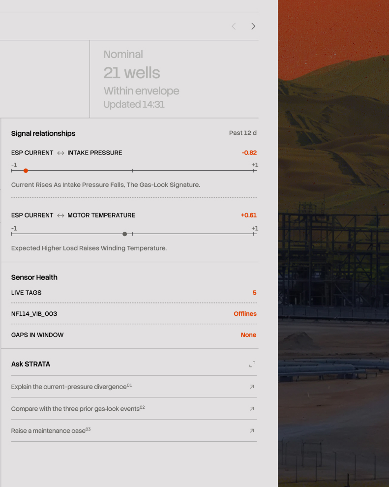
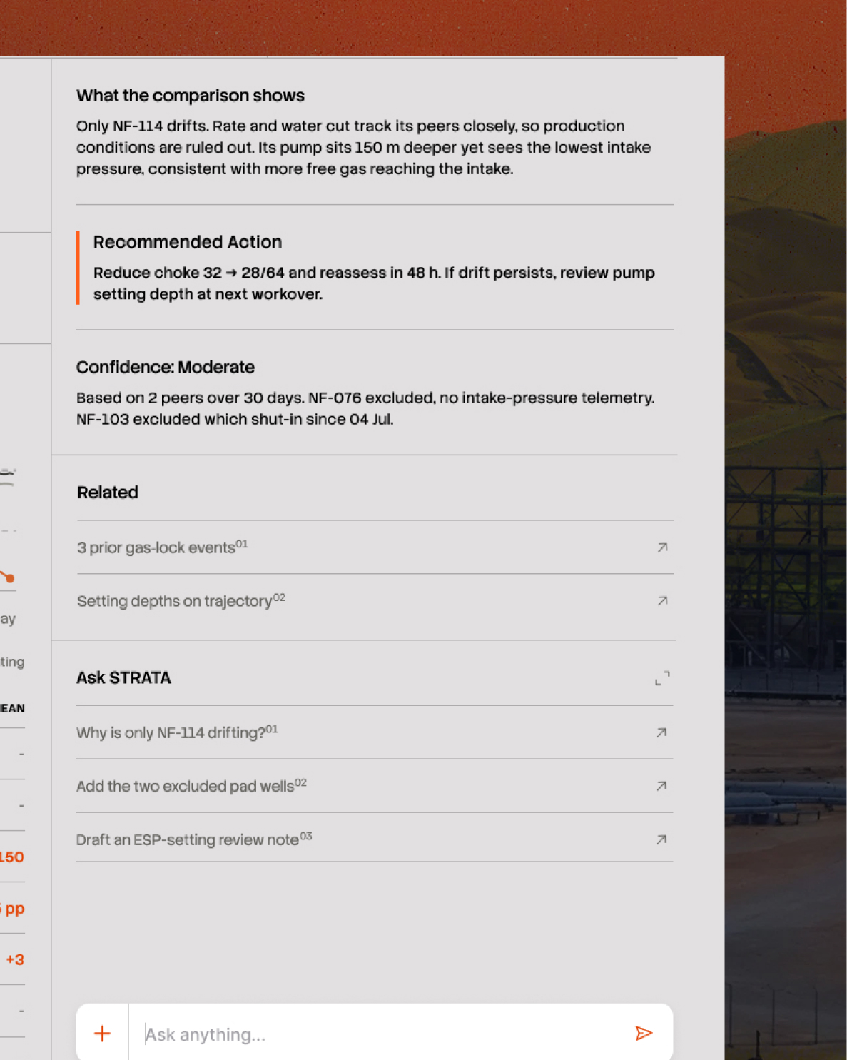
But it doesn't stay on the landing page. Ask STRATA sits in every workspace, and it knows what you're looking at. On a well showing an unusual reading, it offers to explain the divergence. On a comparison between wells, it offers to add the two that were excluded. The suggestions change with the screen, so the next useful question is already written which matters most for the people who know the equipment but don't know what a system like this can be asked.

On mobile it's a floating panel that opens over whatever you're doing, so an engineer standing at a wellhead has the same assistant as someone at a desk.

Behind the same conversation sit four workspaces, each built for a different kind of question, what's about to happen, what's happening to a specific asset, and what needs fixing in the field.

STRAT BY ASKING

STRATA opens with a question box.

That's a deliberate choice about hierarchy. The assistant reads across everything the platform holds . Every well, every sensor reading, every lab result, every filed report which makes it the one part of the product that isn't specialised for a single role.

A production engineer, a process engineer, a supervisor, or a manager who never opens a technical screen can all start in the same place and ask in their own words. That breadth is only useful because of what sits underneath it. STRATA is built on this site's own data, so answers are specific rather than plausible.

Ask why sulfur drifted last month and it reads the actual readings. Ask what a procedure requires and it cites the document, with the page. Answers take whatever form the question needs, a comparison comes back as a chart with the findings stated above it, a data task comes back as a script the engineer can run and check.

But it doesn't stay on the landing page. Ask STRATA sits in every workspace, and it knows what you're looking at. On a well showing an unusual reading, it offers to explain the divergence. On a comparison between wells, it offers to add the two that were excluded. The suggestions change with the screen, so the next useful question is already written which matters most for the people who know the equipment but don't know what a system like this can be asked.

On mobile it's a floating panel that opens over whatever you're doing, so an engineer standing at a wellhead has the same assistant as someone at a desk.

Behind the same conversation sit four workspaces, each built for a different kind of question, what's about to happen, what's happening to a specific asset, and what needs fixing in the field.

PLANTS WAIT HOURS TO KNOW IF THE GAS IS GOOD ENOUGH TO SELL

01\ PREDICTIVE OPERATIONS

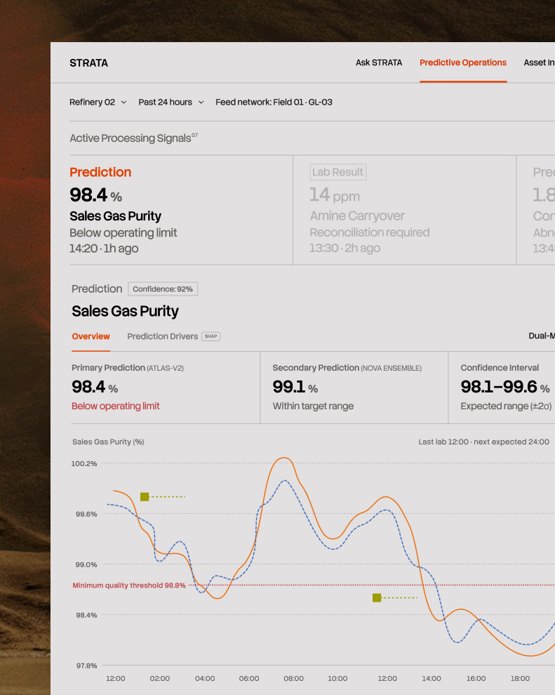
Gas quality isn't something you can read off a gauge as confirming it means taking a physical sample, walking it to a laboratory, and waiting for the analysis. This is how every plant in the industry works. The wait is a physical constraint of the measurement itself. Some results take an hour and others take most of a shift.

So between one sample and the next, the plant runs on a number that may already be hours out of date. If quality started drifting earlier in the shift, nobody knows yet, and every decision made in the meantime rests on a value that's no longer true.

Every refinery lives with this. It's normal enough that it stops being treated as a problem but the cost is real: hours of production where quality is uncertain, and corrections that can only ever be made after the fact.

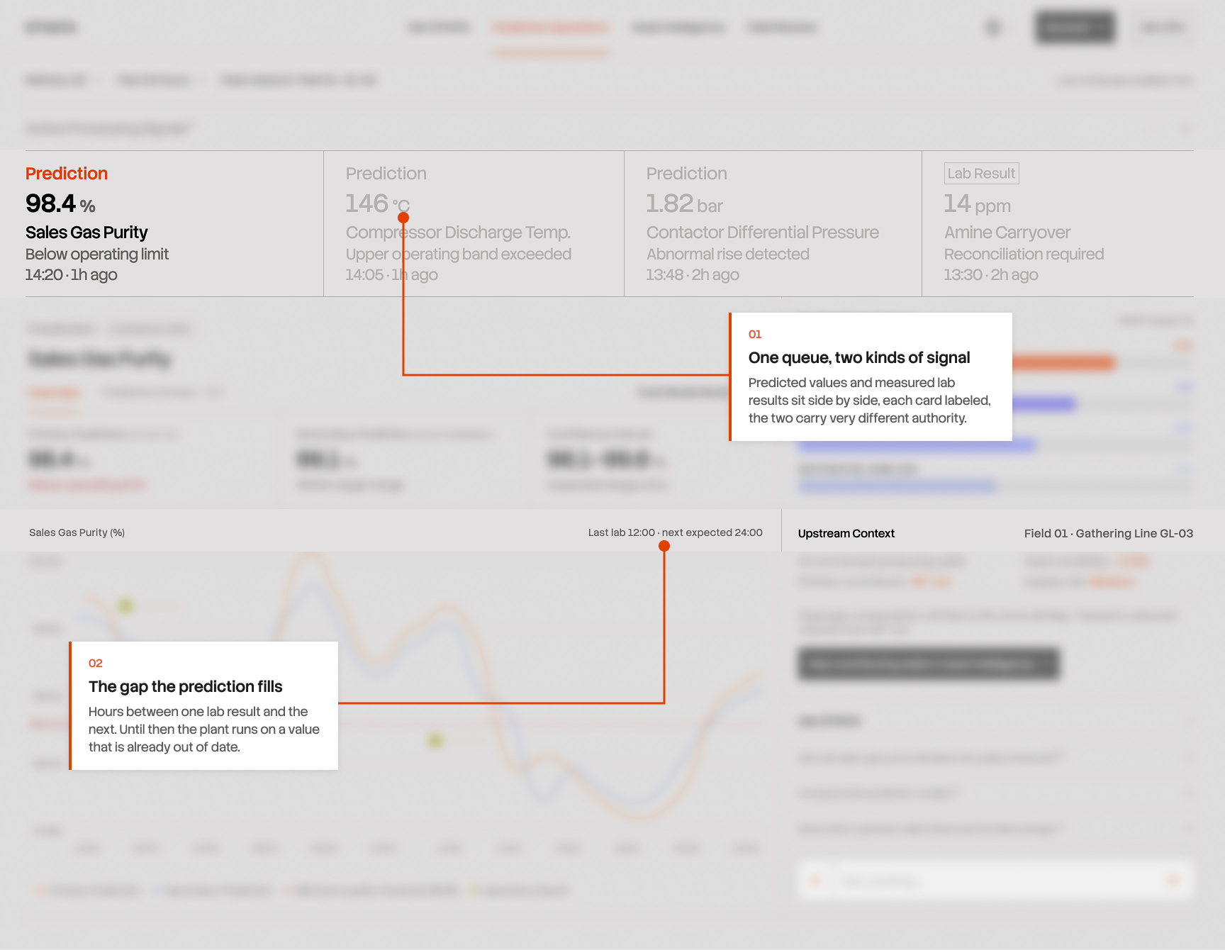
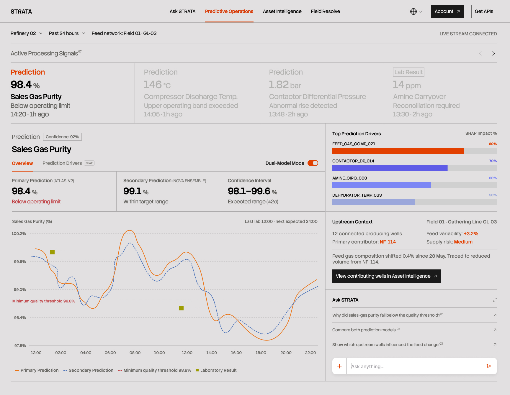
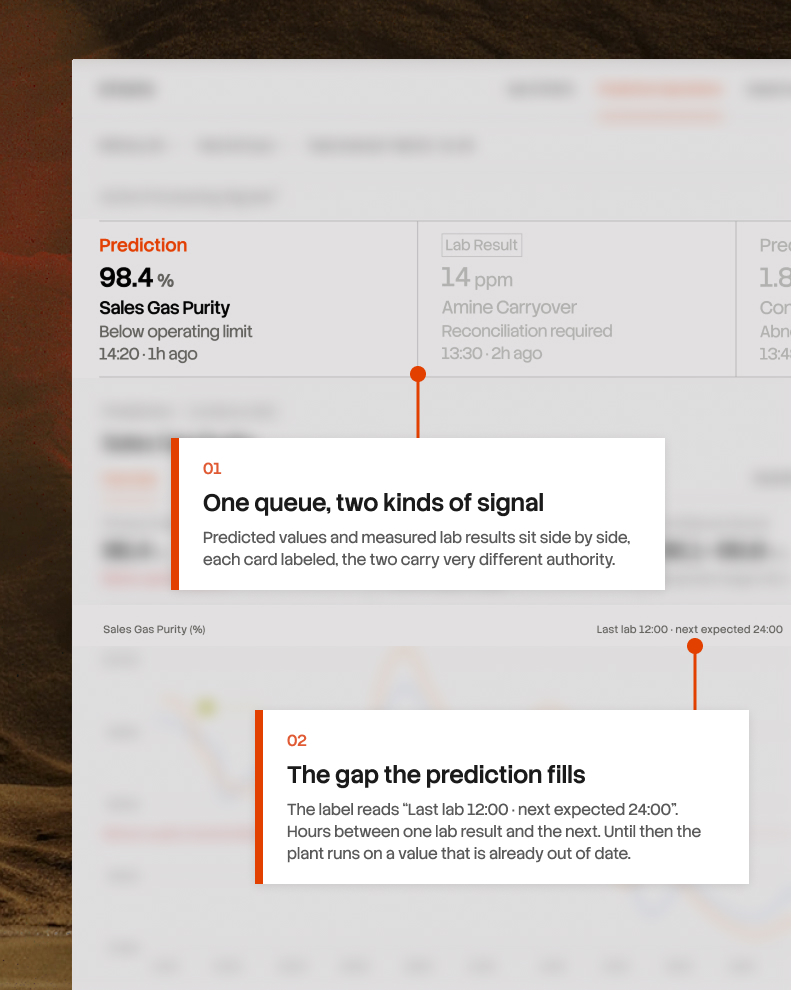
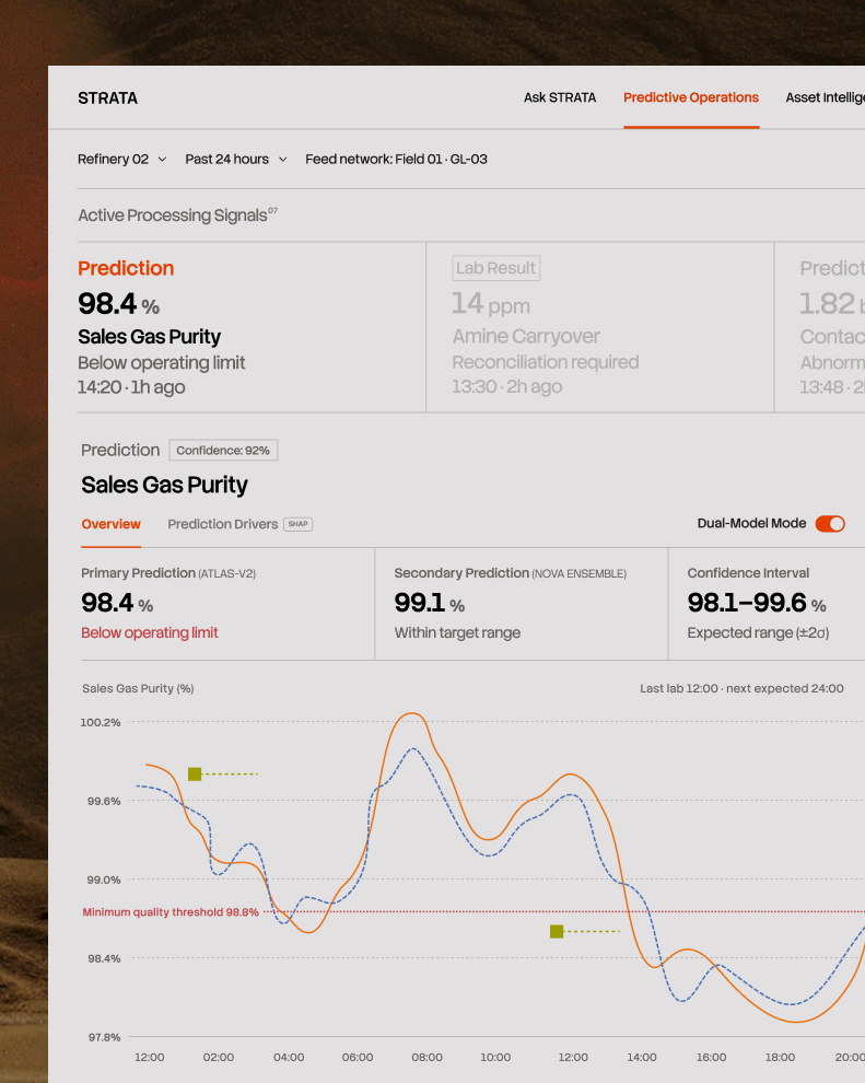
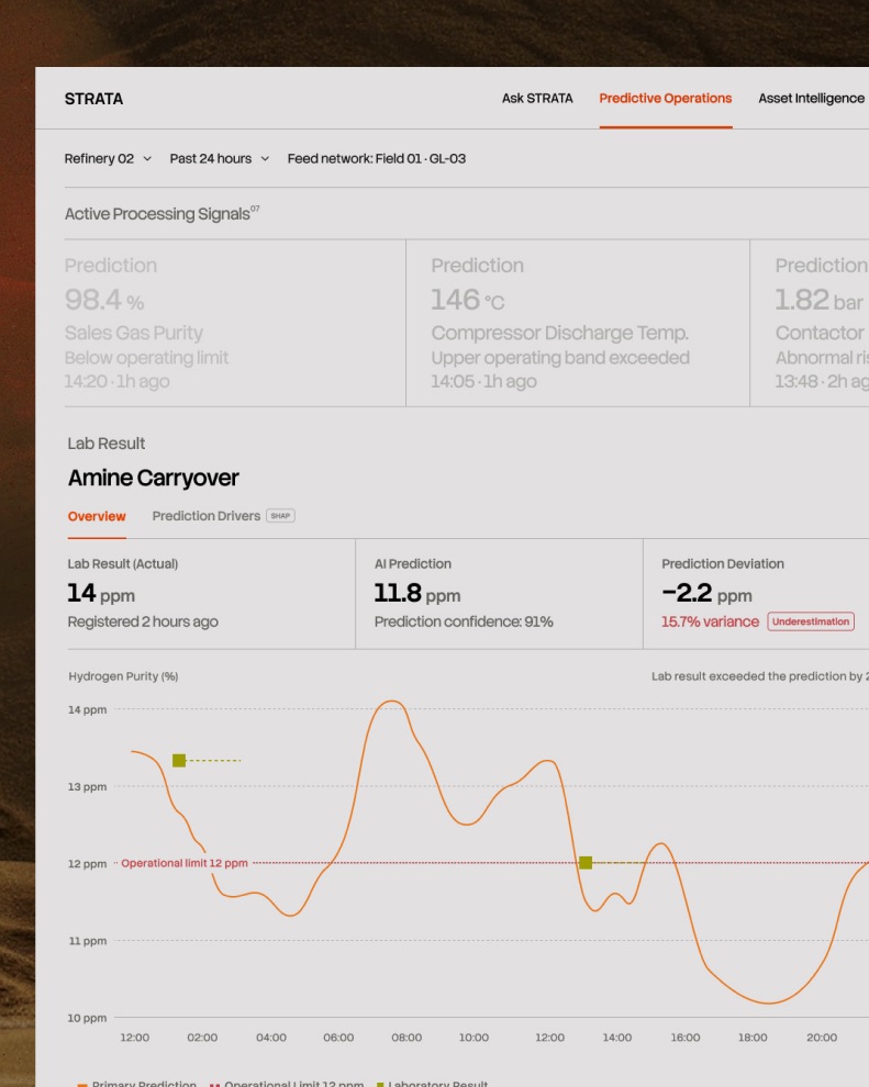
STRATA fills the gap with a continuous prediction. The top of the screen carries both kinds of signal side by side. Predicted values and actual lab results, each card says which it is. A predicted number and a measured one carry different authority, and an engineer scanning for what needs attention has to know instantly which they're looking at.

IN AN INDUSTRY THIS CAUTIOUS, AI HAS TO EARN ITS PLACE

02/ PREDICTIVE OPERATIONS

Predicting the value was the easy half.

The harder problem is that acting on a prediction here isn't like acting on a recommendation in most software. It can mean adjusting how a unit runs, or taking equipment offline that earns money every hour it operates. Get it wrong and the cost is measured in lost production, and sometimes in safety. Engineers in this environment don't take a machine's word for anything and they're right not to.

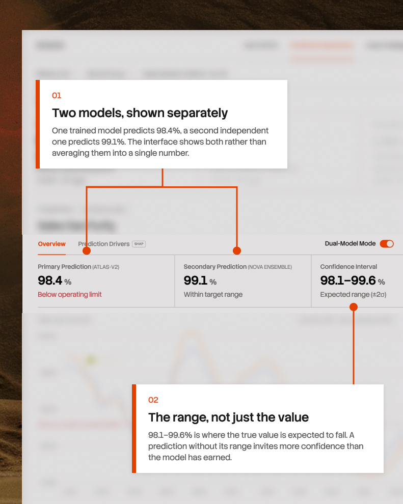
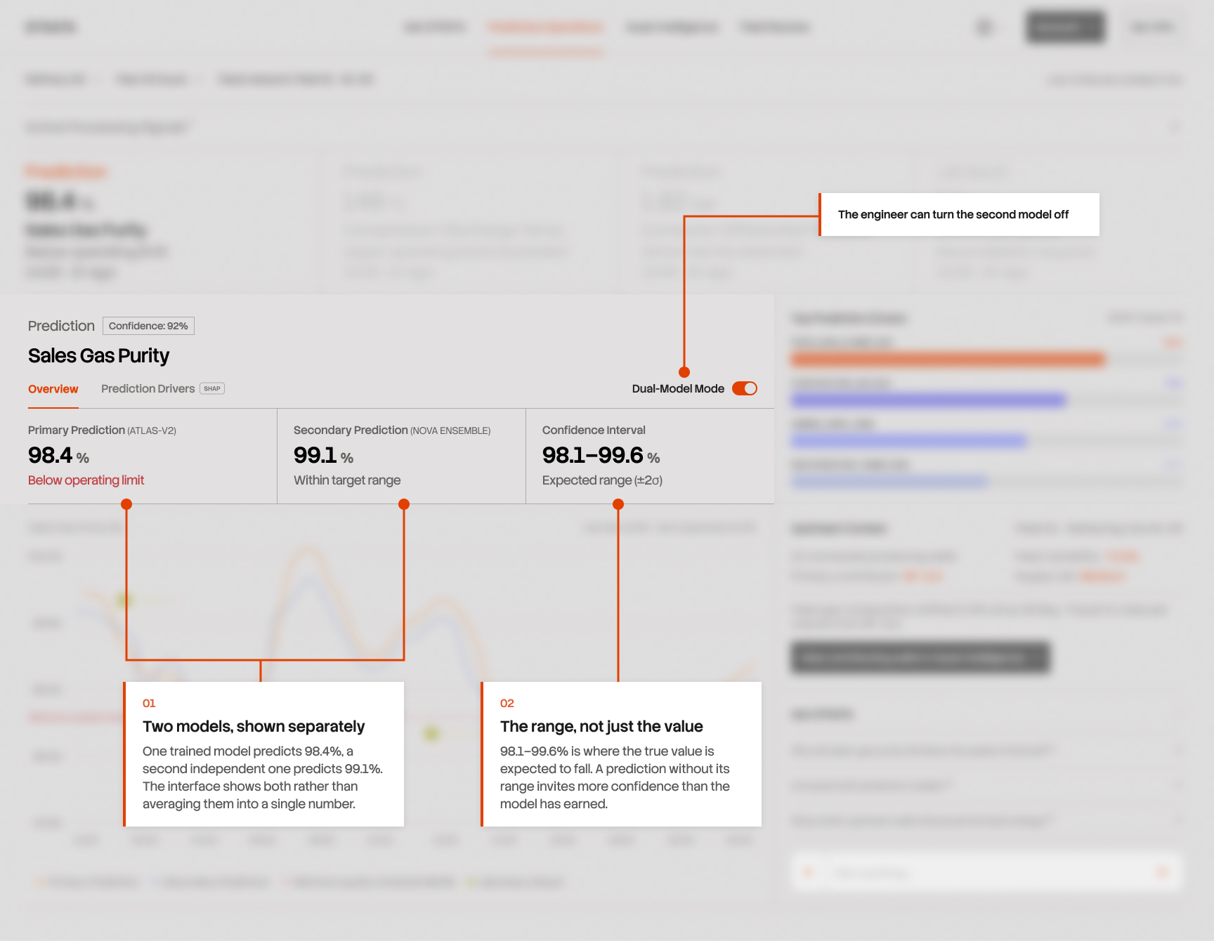
That reluctance is the requirement. So no prediction appears on its own. Each one carries a confidence interval, showing the range the true value is expected to fall within. And a second model, trained independently, runs alongside the first.

When both models agree, that agreement is evidence in itself. When they disagree for example 98.4% against 99.1% then the interface shows the disagreement rather than averaging it into a single number or quietly picking a winner. The engineer sees that the models are uncertain, which is more useful input to a decision than false precision would be.

The same principle governs the whole product: an engineer should always be able to see how confident the system is, and where that confidence comes from.

Designing this took some deciding. It would have been easy to let the prediction quietly disappear once the real number arrived, and the interface would have looked cleaner for it.

But a model that only reports its successes teaches engineers to discount everything it says. One that flags its own misses, quantifies them, and asks to be corrected earns the opposite reaction and it gives the people maintaining the model the signal they need to improve it. Trust here is built by being checkable.

A SYSTEM THAT HIDES ITS MISSES IS A SYSTEM THAT STOPS GETTING USED

03/ PREDICTIVE OPERATIONS

Eventually the sample is analysed and the real number comes back. This is the moment a prediction can be checked and it's the moment most AI products go quiet.

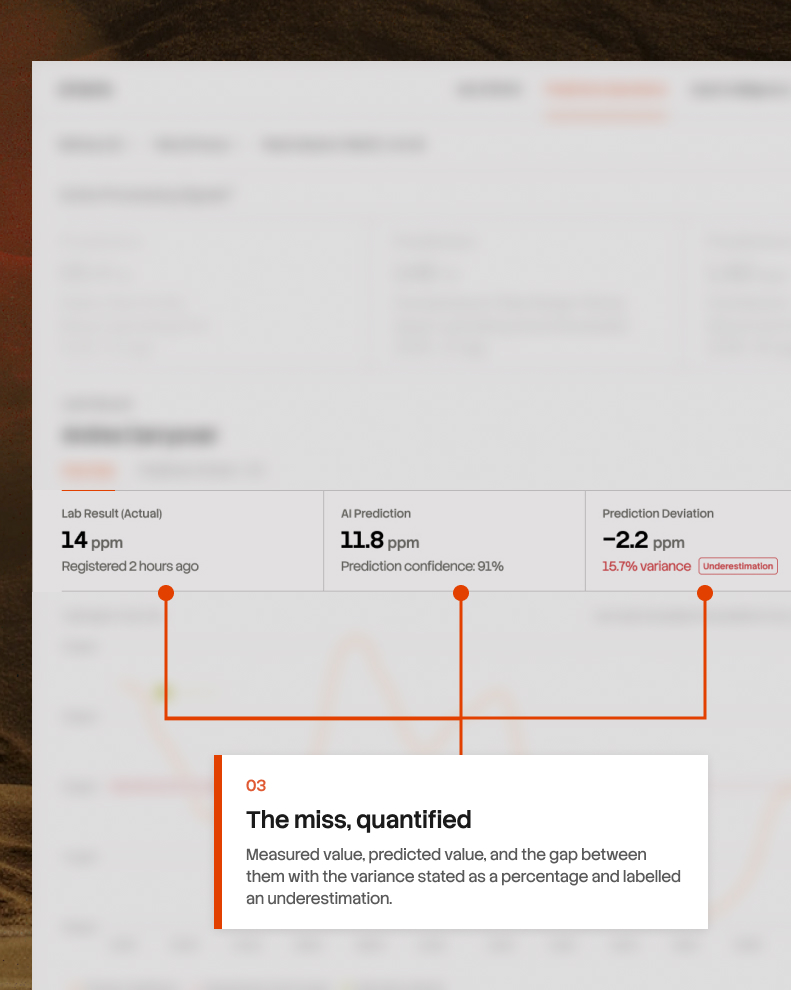
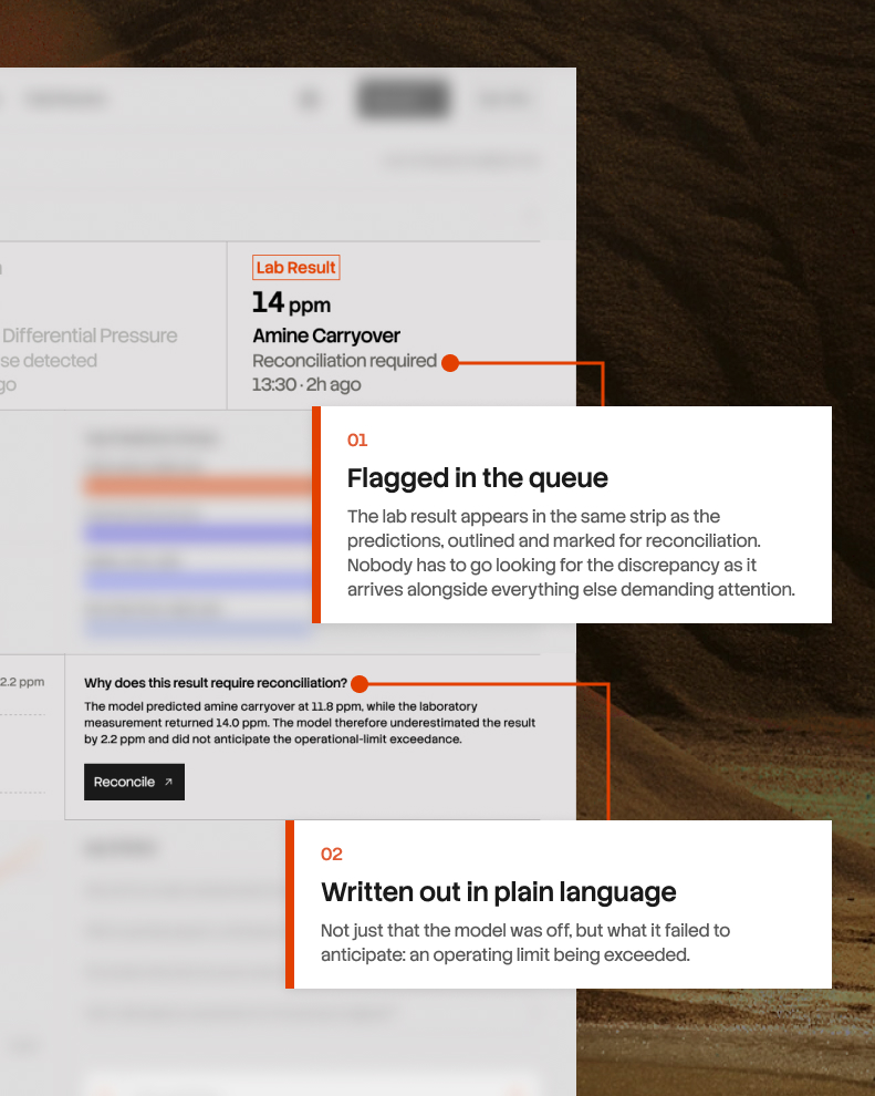
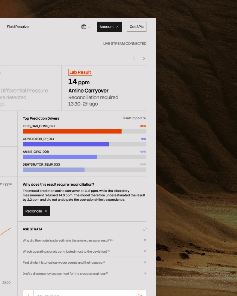
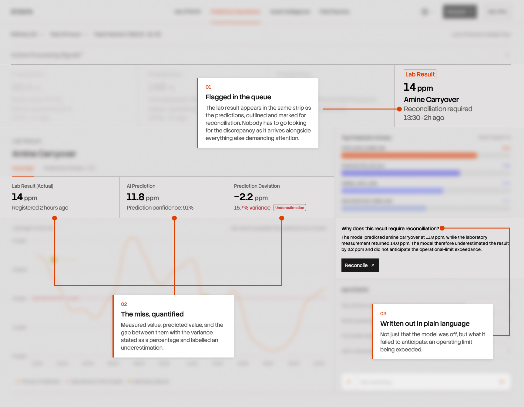
The lab measured 14.0 ppm. The model had predicted 11.8. It was wrong by 2.2 ppm, and more seriously, it had failed to anticipate that an operating limit would be exceeded at all.

STRATA surfaces that as a signal in its own right. The lab result enters the same queue as the predictions, flagged for reconciliation, showing the measured value, the predicted value, the gap between them, and the word underestimation. The explanation is written plainly: the model predicted 11.8, the laboratory returned 14.0, and it did not anticipate the exceedance.

PLANTS WAIT HOURS TO KNOW IF THE GAS IS GOOD ENOUGH TO SELL

PLANTS WAIT HOURS TO KNOW IF THE GAS IS GOOD ENOUGH TO SELL

01\ PREDICTIVE OPERATIONS

Gas quality isn't something you can read off a gauge as confirming it means taking a physical sample, walking it to a laboratory, and waiting for the analysis. This is how every plant in the industry works. The wait is a physical constraint of the measurement itself. Some results take an hour and others take most of a shift.

So between one sample and the next, the plant runs on a number that may already be hours out of date. If quality started drifting earlier in the shift, nobody knows yet, and every decision made in the meantime rests on a value that's no longer true.

Every refinery lives with this. It's normal enough that it stops being treated as a problem but the cost is real: hours of production where quality is uncertain, and corrections that can only ever be made after the fact.

STRATA fills the gap with a continuous prediction. The top of the screen carries both kinds of signal side by side. Predicted values and actual lab results, each card says which it is. A predicted number and a measured one carry different authority, and an engineer scanning for what needs attention has to know instantly which they're looking at.
THE GAS QUALITY DROPPED, AND THE SYSTEM CAN SHOW EXACTLY WHY

04/ PREDICTIVE OPERATIONS

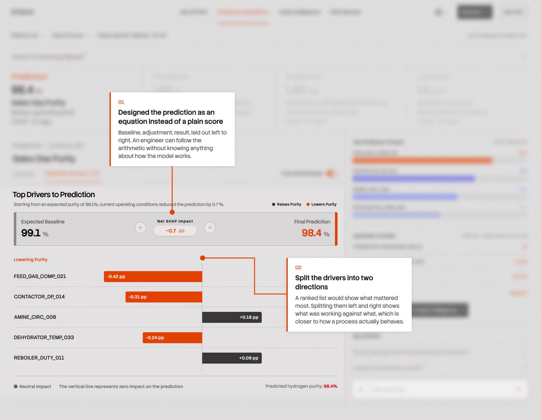
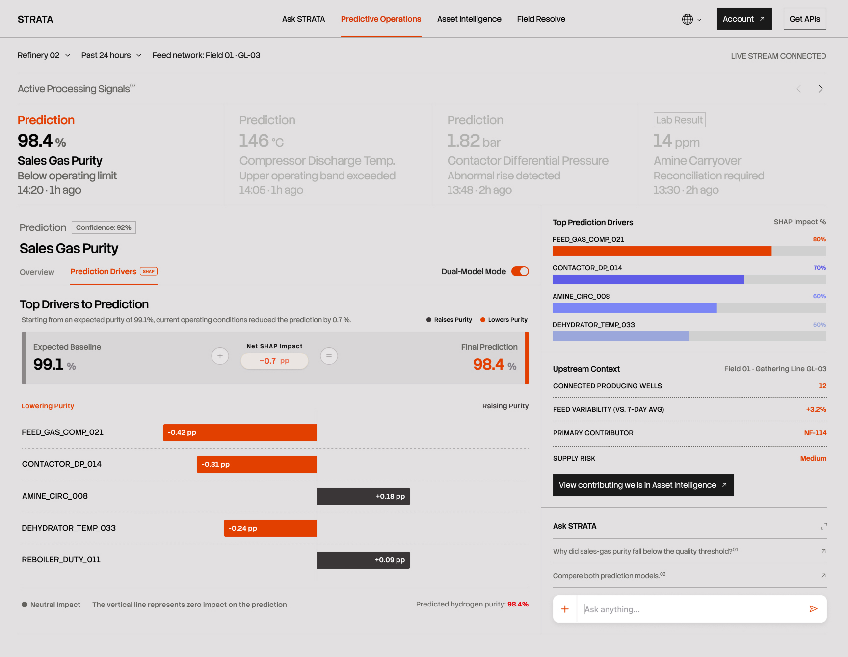
The purity reading which communicates how clean the gas is, and whether it meets what the customer is owed had fallen below its operating limit. The remaining question is the one that makes any number usable: why.

The prediction is calculated from physical sensors placed throughout the unit. The physical sensors measure temperature, pressure, flow, chemical composition, each reporting continuously. But knowing a number came from sensors doesn't tell you which sensors mattered. So the second tab titled "Prediction Drivers (SHAP)" breaks the prediction apart and shows exactly that.

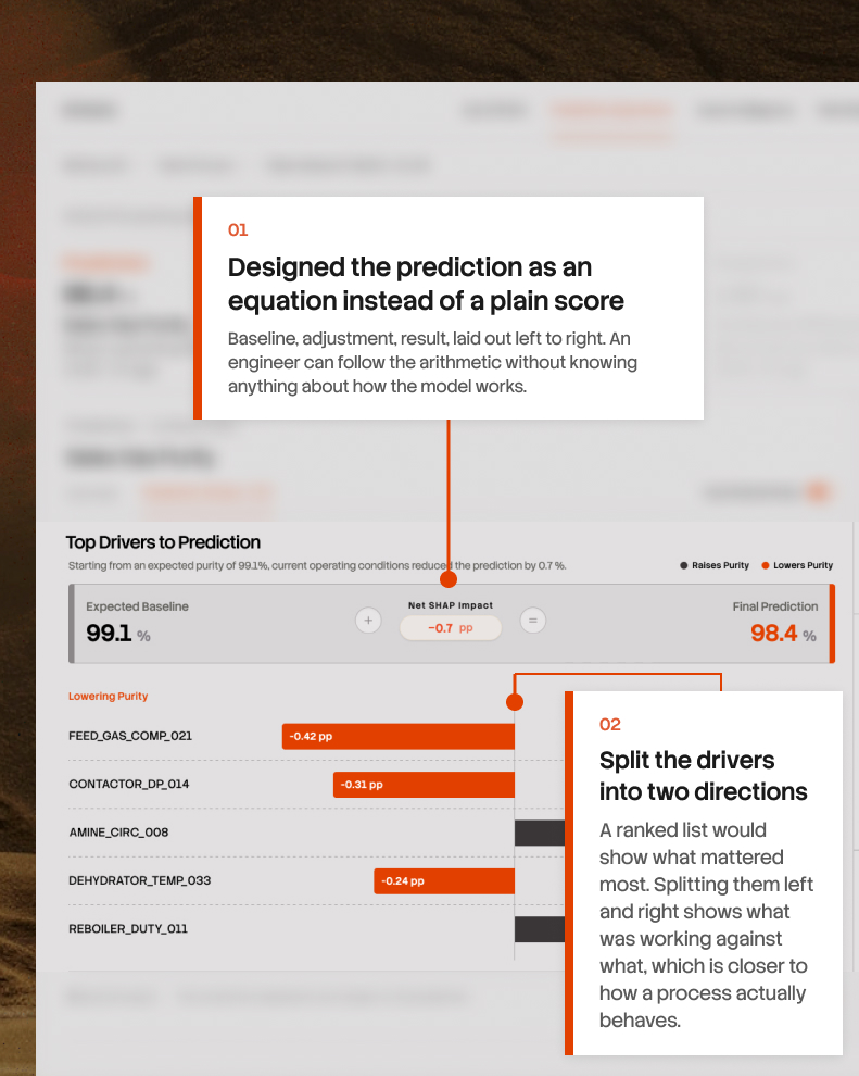
It reads as a sum. Under normal conditions this unit would produce 99.1% purity. Current conditions pulled it down by 0.7, landing at 98.4%. Underneath, the individual sensors responsible, some pushing purity down, some pushing it up, each with its own share of the effect.

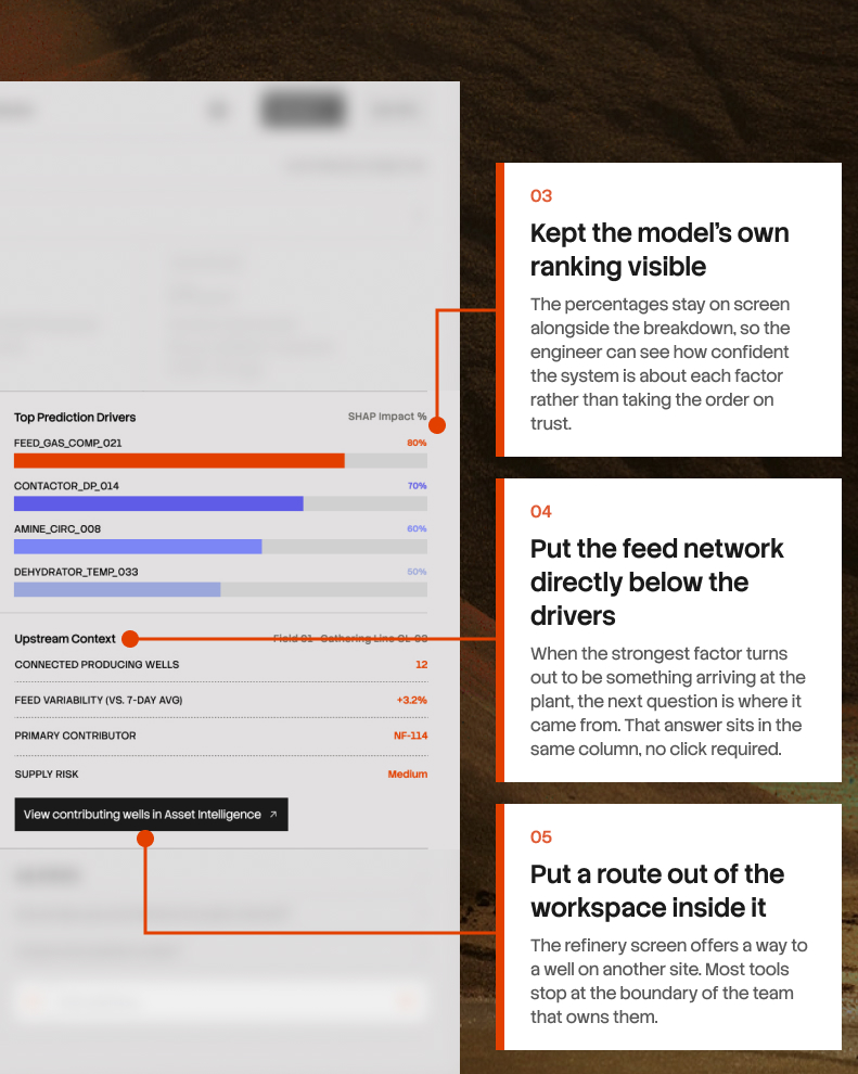
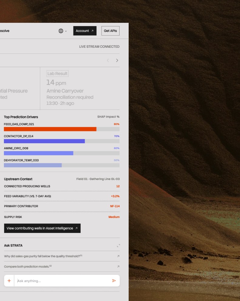
The strongest driver on that list is FEED_GAS_COMP_021 at 80%. It accounts for most of the drop.

The other four sensors measure things happening inside the plant: how hot a stage is running, how much pressure is building, how fast a chemical is circulating. All of those are settings. If one of them were causing the problem, an engineer could change it today.

This one is different. The top driver FEED_GAS_COMP_021 measures what the gas is made of when it arrives, before the plant has done anything to it. Nobody can adjust that as it describes the raw material coming in so nothing here is broken. The equipment is working correctly, working correctly on gas that isn't the same as the gas it's been processing for months.

The panel below the list titled "Upstream Context", shows where the gas comes from. Twelve wells feed this plant, and their output is mixed together. When one well changes, the mixture changes. In late May, one of them produced less, and the composition shifted.

That well has a name, NF-114, and it can be opened from this screen without leaving for another system.

Feed composition (the top driver sensor) could have been left as one more sensor in the list, with no explanation of where that gas comes from. I put the feed network "Upstream Context" directly beneath it, so the moment an engineer sees an incoming property at the top of the drivers, the answer to "from where" is already on screen. A workspace that can only explain what happens inside its own fence isn't much use in an operation where the fence is arbitrary.

After
Before
After
Before

EVENTUALLY, SOMEONE HAS TO GO OUT & FIX IT

09/ FIELD RESOLVE

Everything so far happened at a desk. But wells and plants are physical, and at some point a person walks out to the equipment with a wrench. That handover is where most of the work gets lost. The engineer who spent an hour building a picture of the problem writes a short summary into a maintenance system, a technician picks it up with none of that context, and often files a second report describing what they found. Two people, two records, one problem, nothing connecting them.

Field problems also don't arrive one at a time. On any given day there's a backlog: a leak here, a missing handrail there, corrosion on a line somewhere else, arriving from different people at different times with wildly different urgency.

So the screen opens with four cases pulled to the top. A critical leak twelve minutes old, then three high-severity issues. Below that, everything else in a table with severity, status, and who owns it.

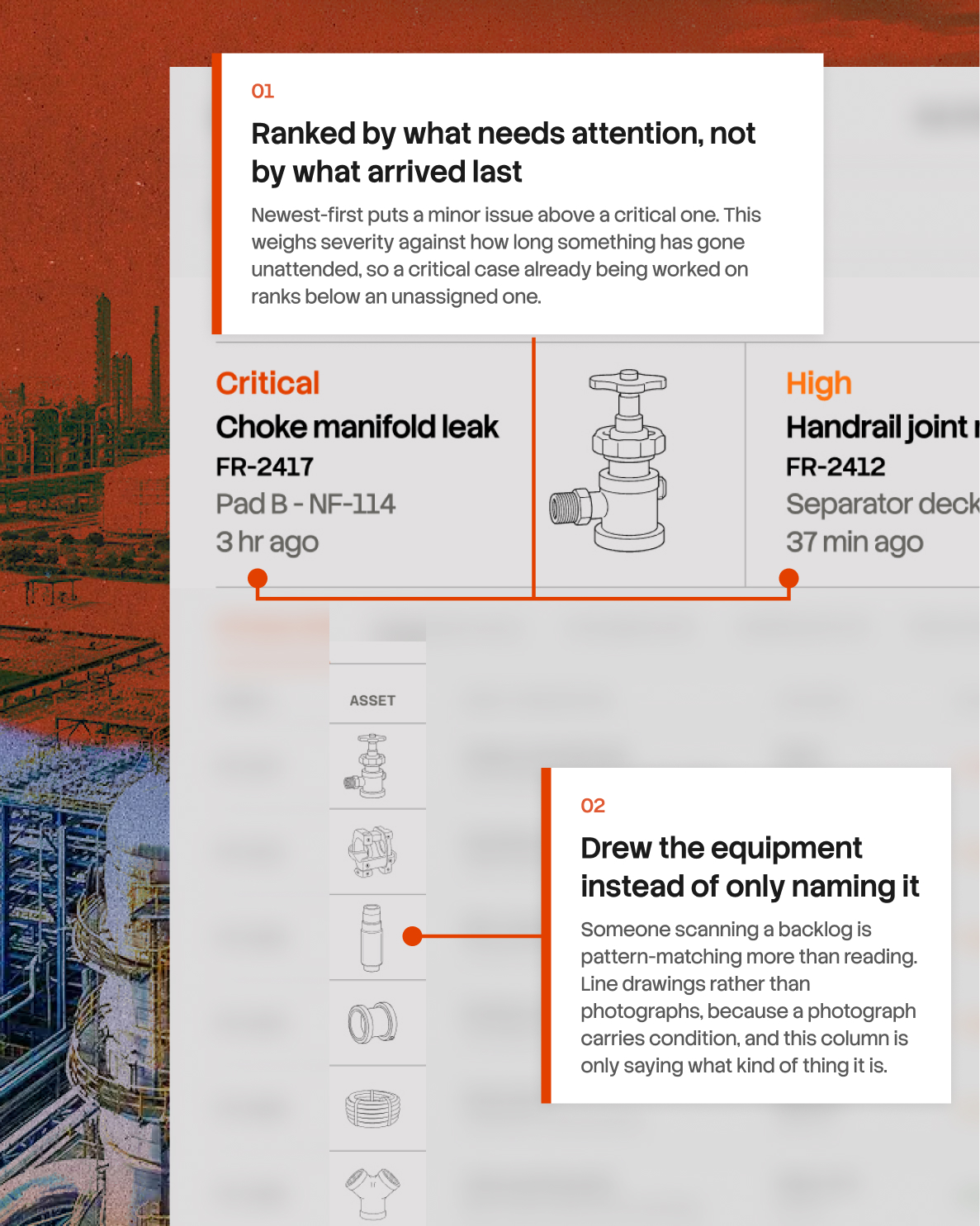
The decision here was ordering. Sorting by newest is the obvious default and it's wrong, because it puts a low-severity report from ten minutes ago above a critical one from an hour ago. Sorting purely by severity is also wrong, because a critical case already assigned and being worked on needs less attention than an unassigned one. The queue weighs severity against how long something has gone unattended, and the four at the top are what the system thinks should be dealt with first.

The asset column uses line drawings rather than text alone. Someone scanning a backlog is pattern-matching more than reading, and a valve, a hose, and a flange are distinguishable at a glance in a way that "choke manifold leak" and "valve packing leak" are not. I used technical illustrations rather than photographs deliberately. A photograph of equipment carries information about its condition, and in this column the only claim being made is what kind of thing it is.

The right-hand column is the reporting entry point rather than a filter panel. This workspace is used by people about to add to the queue as often as by people working through it. And it's the one part of the platform designed for a phone first, because it's the only part used standing up.

After
Before
After
Before

FROM A PHOTOGRAPH TO A CLOSED CASE

10/ FIELD RESOLVE

A field worker standing at a leaking flange has a phone and a problem in front of them. What they don't have is patience for eleven form fields, which is why field reports are so often two words long and useless to whoever picks them up.

So the report starts with the photograph. STRATA reads the image, identifies the equipment, and fills the form in: asset, location, issue type, severity, and a description of what it can see. The person confirms or corrects rather than typing from nothing.

Analysis takes a few seconds, which is long enough to feel broken if nothing happens. A spinner would have covered it. Instead the screen names each step as it completes: identifying equipment, inspecting visible condition, checking similar field records. That fills the wait, but it also tells the truth about what's happening, and the third step is worth knowing about because searching previous cases is different work from reading a photograph.

The decision I spent longest on was how much to prefill. Fill everything and people click through without reading, which is worse than an empty form because now there's a plausible-looking record nobody checked. So each proposed value carries its confidence, 94% on the asset and 87% on the likely issue, and the section is labelled prefilled by STRATA. The system is making a proposal and the interface says so.

That's the report. What happens to it afterwards was the harder design problem.

Months later, someone will ask what happened here. Maybe an auditor, maybe an incident investigation, maybe an engineer whose well is doing the same thing. So the case record is built to answer that rather than to look finished.

The original photograph sits beside the one taken after the repair, labelled before and after, each with its own timestamp and the name of who took it. Two people, two moments, and the visual evidence that the problem existed and then didn't.

STRATA's original assessment stays on the record with its confidences intact, next to what was actually found and done. If the system identified the wrong equipment or underestimated the severity, that's preserved rather than quietly overwritten by the outcome. A system that edits its own history to look correct isn't a record of anything.

The state changes are the part I'd defend hardest. Reported, assigned, in progress, awaiting verification, resolved, each with a person and a time. Verification is a separate step performed by someone other than whoever did the work, because a technician marking their own repair complete isn't a check on anything. That distinction is the difference between a workflow and an audit trail.

This is the least glamorous screen in the product, and the one that decides whether any of the rest of it can be trusted six months from now.

After
Before
After
Before

WHAT STRATA BECAME

Every part of this problem already has software. Sensor systems, laboratory systems, maintenance systems, document archives. None of them is broken, and I didn't set out to replace any of them. What none of them does is hold on to context when the problem moves somewhere else. A refinery tool stops at the refinery fence. A maintenance system knows about work orders and nothing about why the work was ordered. So the joining falls to a person, every time, from scratch, and most of the time it doesn't happen at all.

STRATA is one continuous thread through that. A prediction explains itself, and the explanation points upstream. The well it points to carries its own history, its own comparisons, and its own record of what changed and when. When something needs fixing, the case that gets raised carries all of it, and closes with evidence anyone can check months later.

Three things held throughout. Show the reasoning, not just the answer, because an unexplained number is an unused one. Say what you don't know, because a system that only reports its successes teaches people to discount everything it says. And let the work cross the boundaries the problem crosses, because the org chart is a human invention and the barrel moves through all of it.

This is a concept, and it hasn't been tested with the people it's for. The things I'd most want to put in front of a real production engineer are the ones I'm least sure about: whether the peer selection criteria match how they judge comparability, whether confidence percentages help or just add noise, and whether surfacing the model's own errors builds trust or erodes it faster than I think.

All data shown is fictional. The problems it describes are real.

After
Before
After
Before

IN AN INDUSTRY THIS CAUTIOUS, AI HAS TO EARN ITS PLACE

IN AN INDUSTRY THIS CAUTIOUS, AI HAS TO EARN ITS PLACE

02\ PREDICTIVE OPERATIONS

Predicting the value was the easy half.

The harder problem is that acting on a prediction here isn't like acting on a recommendation in most software. It can mean adjusting how a unit runs, or taking equipment offline that earns money every hour it operates. Get it wrong and the cost is measured in lost production, and sometimes in safety. Engineers in this environment don't take a machine's word for anything and they're right not to.

That reluctance is the requirement. So no prediction appears on its own. Each one carries a confidence interval, showing the range the true value is expected to fall within. And a second model, trained independently, runs alongside the first.

When both models agree, that agreement is evidence in itself. When they disagree for example 98.4% against 99.1% then the interface shows the disagreement rather than averaging it into a single number or quietly picking a winner. The engineer sees that the models are uncertain, which is more useful input to a decision than false precision would be.

The same principle governs the whole product: an engineer should always be able to see how confident the system is, and where that confidence comes from.

After
Before

A SYSTEM THAT HIDES ITS MISSES IS A SYSTEM THAT STOPS GETTING USED

A SYSTEM THAT HIDES ITS MISSES IS A SYSTEM THAT STOPS GETTING USED

03\ PREDICTIVE OPERATIONS

Eventually the sample is analysed and the real number comes back. This is the moment a prediction can be checked and it's the moment most AI products go quiet.

The lab measured 14.0 ppm. The model had predicted 11.8. It was wrong by 2.2 ppm, and more seriously, it had failed to anticipate that an operating limit would be exceeded at all.

STRATA surfaces that as a signal in its own right. The lab result enters the same queue as the predictions, flagged for reconciliation, showing the measured value, the predicted value, the gap between them, and the word underestimation. The explanation is written plainly: the model predicted 11.8, the laboratory returned 14.0, and it did not anticipate the exceedance.
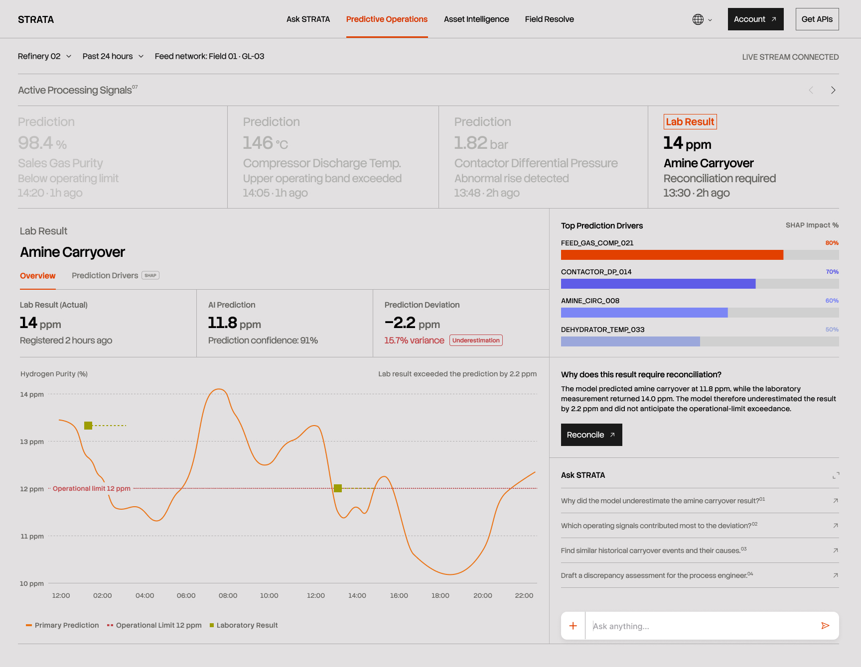
Designing this took some deciding. It would have been easy to let the prediction quietly disappear once the real number arrived, and the interface would have looked cleaner for it.

But a model that only reports its successes teaches engineers to discount everything it says. One that flags its own misses, quantifies them, and asks to be corrected earns the opposite reaction and it gives the people maintaining the model the signal they need to improve it. Trust here is built by being checkable.

After
Before

THE GAS QUALITY DROPPED, AND THE SYSTEM CAN SHOW EXACTLY WHY

THE GAS QUALITY DROPPED, AND THE SYSTEM CAN SHOW EXACTLY WHY

04\ PREDICTIVE OPERATIONS

The purity reading which communicates how clean the gas is, and whether it meets what the customer is owed had fallen below its operating limit. The remaining question is the one that makes any number usable: why.

The prediction is calculated from physical sensors placed throughout the unit. The physical sensors measure temperature, pressure, flow, chemical composition, each reporting continuously. But knowing a number came from sensors doesn't tell you which sensors mattered. So the second tab titled "Prediction Drivers (SHAP)" breaks the prediction apart and shows exactly that.

It reads as a sum. Under normal conditions this unit would produce 99.1% purity. Current conditions pulled it down by 0.7, landing at 98.4%. Underneath, the individual sensors responsible, some pushing purity down, some pushing it up, each with its own share of the effect.

After
Before

The strongest driver on that list is FEED_GAS_COMP_021 at 80%. It accounts for most of the drop.

The other four sensors measure things happening inside the plant: how hot a stage is running, how much pressure is building, how fast a chemical is circulating. All of those are settings. If one of them were causing the problem, an engineer could change it today.

This one is different. The top driver FEED_GAS_COMP_021 measures what the gas is made of when it arrives, before the plant has done anything to it. Nobody can adjust that as it describes the raw material coming in so nothing here is broken. The equipment is working correctly, working correctly on gas that isn't the same as the gas it's been processing for months.

The panel below the list titled "Upstream Context", shows where the gas comes from. Twelve wells feed this plant, and their output is mixed together. When one well changes, the mixture changes. In late May, one of them produced less, and the composition shifted.

That well has a name, NF-114, and it can be opened from this screen without leaving for another system.

Feed composition (the top driver sensor) could have been left as one more sensor in the list, with no explanation of where that gas comes from. I put the feed network "Upstream Context" directly beneath it, so the moment an engineer sees an incoming property at the top of the drivers, the answer to "from where" is already on screen. A workspace that can only explain what happens inside its own fence isn't much use in an operation where the fence is arbitrary.

After
Before

AN ALERT MEANS LITTLE IF YOU CAN'T PLACE IT ON THE ASSET

05/ ASSET INTELLIGENCE

The previous investigation ended hundreds of kilometres away from the processing plant.

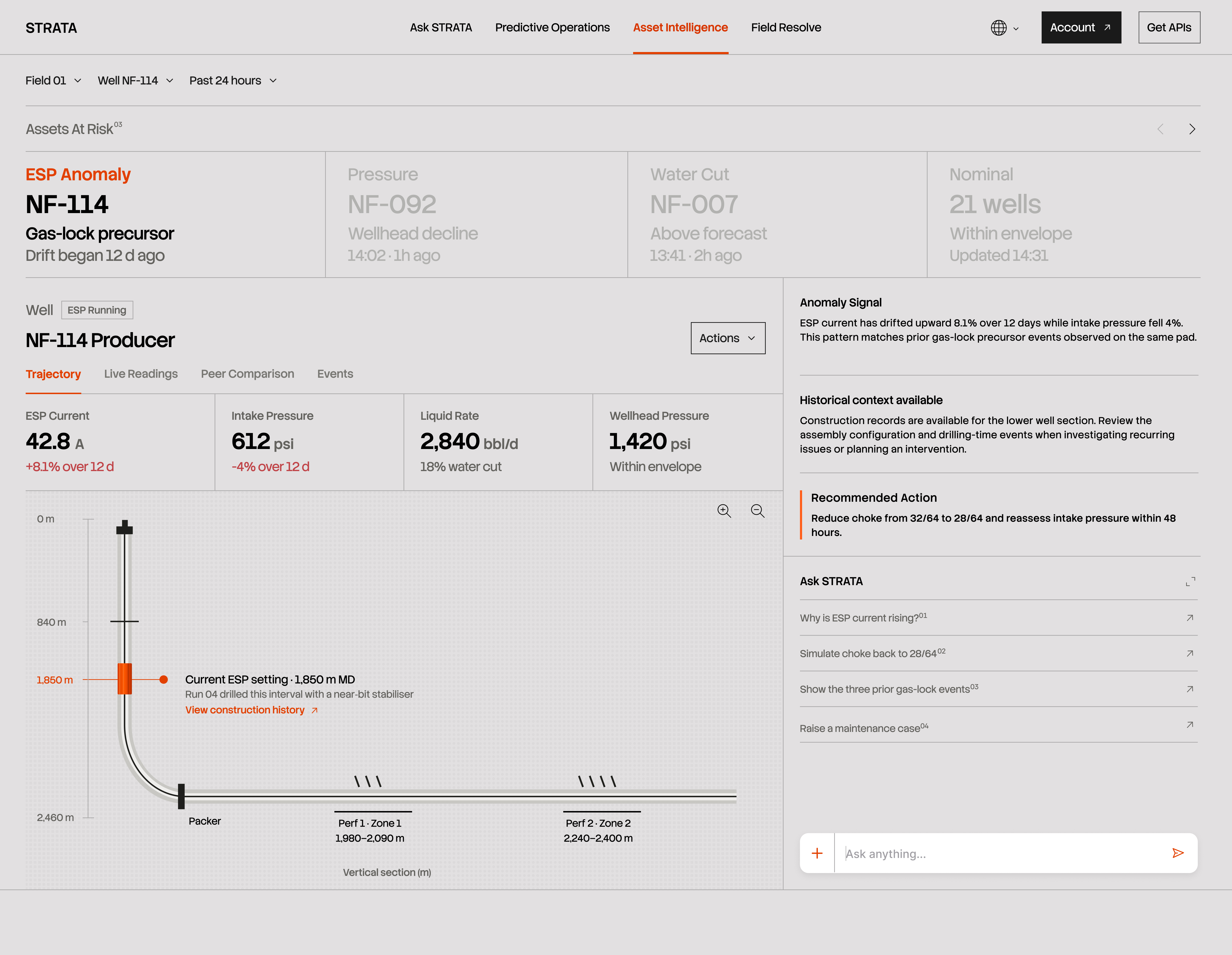
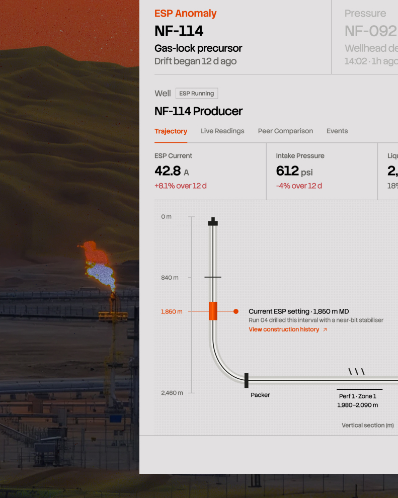
STRATA had traced the change in incoming gas back to one producing well: NF-114. But identifying the well only narrows the search. It doesn't explain what is happening inside it.

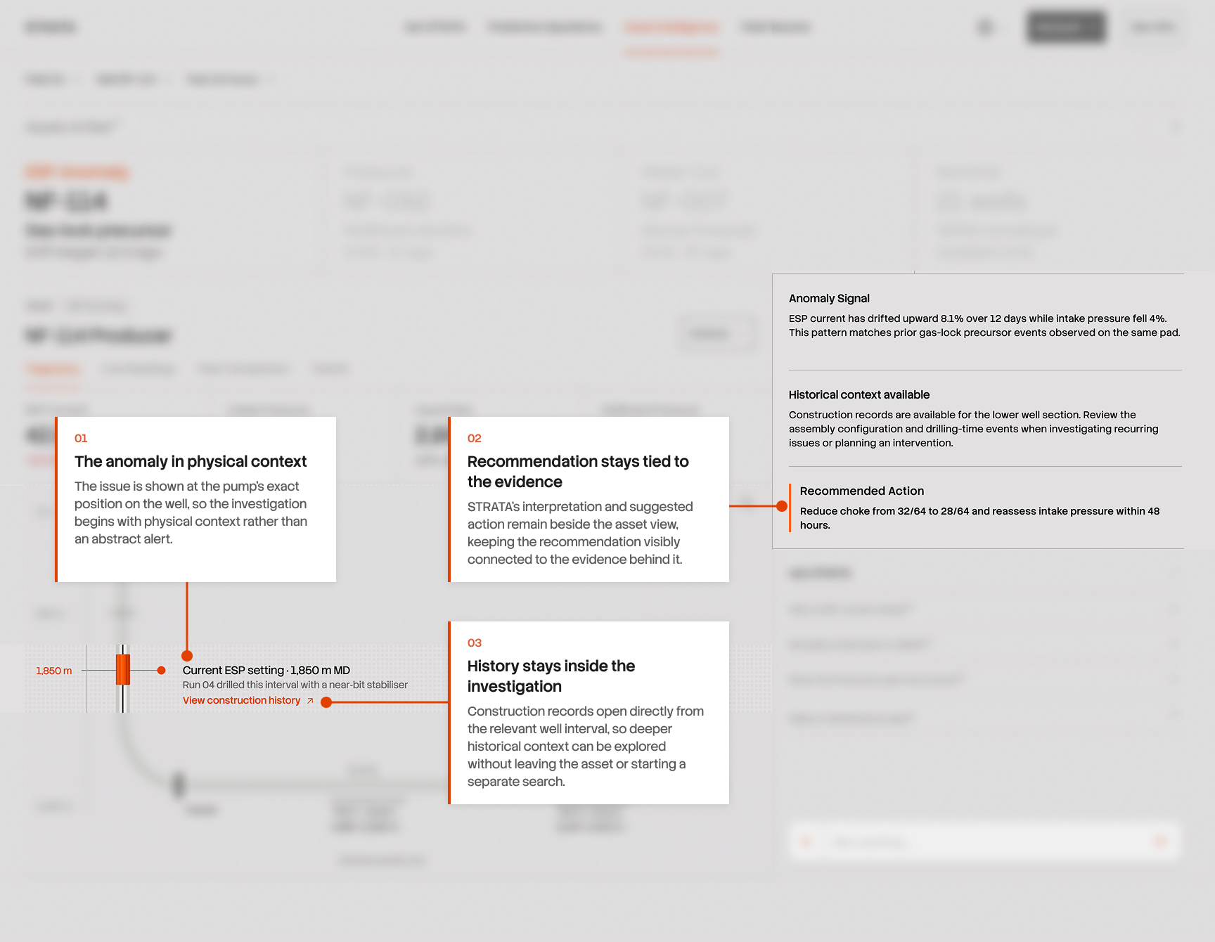
A producing well can extend kilometres underground, with critical equipment installed at specific points along its path. In NF-114, the pump STRATA is watching sits 1,850 metres below the surface. Its electrical load had been rising while the pressure entering it was falling, a combination worth investigating.

Most monitoring tools begin with the readings. I wanted the investigation to begin with the asset itself.

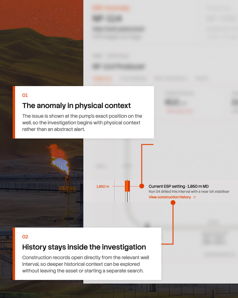
So the first view places the pump directly on the well trajectory, with its current operating condition attached to the same location. From there, an engineer can move into live behaviour or reach back into how that section of the well was constructed without losing the context that brought them there.
AN ALERT MEANS LITTLE IF YOU CAN'T PLACE IT ON THE ASSET

05/ ASSET INTELLIGENCE

The previous investigation ended hundreds of kilometres away from the processing plant.

STRATA had traced the change in incoming gas back to one producing well: NF-114. But identifying the well only narrows the search. It doesn't explain what is happening inside it.

A producing well can extend kilometres underground, with critical equipment installed at specific points along its path. In NF-114, the pump STRATA is watching sits 1,850 metres below the surface. Its electrical load had been rising while the pressure entering it was falling, a combination worth investigating.

Most monitoring tools begin with the readings. I wanted the investigation to begin with the asset itself.

So the first view places the pump directly on the well trajectory, with its current operating condition attached to the same location. From there, an engineer can move into live behaviour or reach back into how that section of the well was constructed without losing the context that brought them there.
After
Before

SOMETIMES THE INVESTIGATION HAS TO GO BACK TO HOW THE WELL WAS BUILT

The trajectory tells an engineer where the pump sits today. But when an issue keeps returning, the current state is only part of the story. Engineers may also need to understand how that section of the well was originally constructed, which assembly was used, how the run progressed through depth, and whether anything unusual was recorded along the way.

That information usually exists in construction records and drilling reports. Useful, but disconnected from the well the engineer is already investigating.

I wanted that history to feel like another layer of the asset.

From the highlighted interval, STRATA opens a construction replay that moves through the historical run by depth and time. Components and recorded events appear where they occurred, while the trajectory stays visible alongside it, keeping the past tied to the physical location that made it relevant.

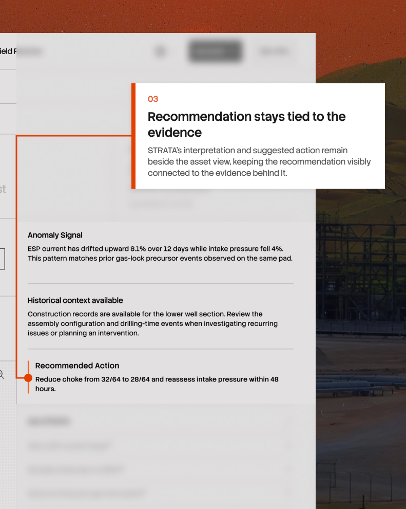
Importantly, STRATA treats this as context. A historical event near the same interval may be worth investigating, but the interface never presents it as the cause of what is happening today.

A WELL CAN'T TELL YOU WHAT'S WRONG, ONLY THAT SOMETHING IS

06/ ASSET INTELLIGENCE

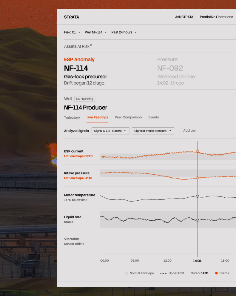
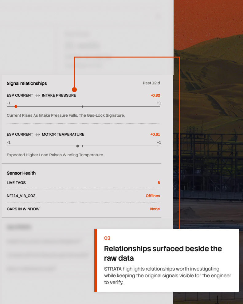
A well is a hole in the ground with a pump at the bottom. You can't inspect it. Nobody goes down to look. Everything anyone knows about it comes from a handful of sensors reporting numbers to the surface, and those numbers only say how much, how much current, how much pressure, how much liquid. Never why.

That changed what I was designing. This screen for noticing when two numbers stop agreeing.

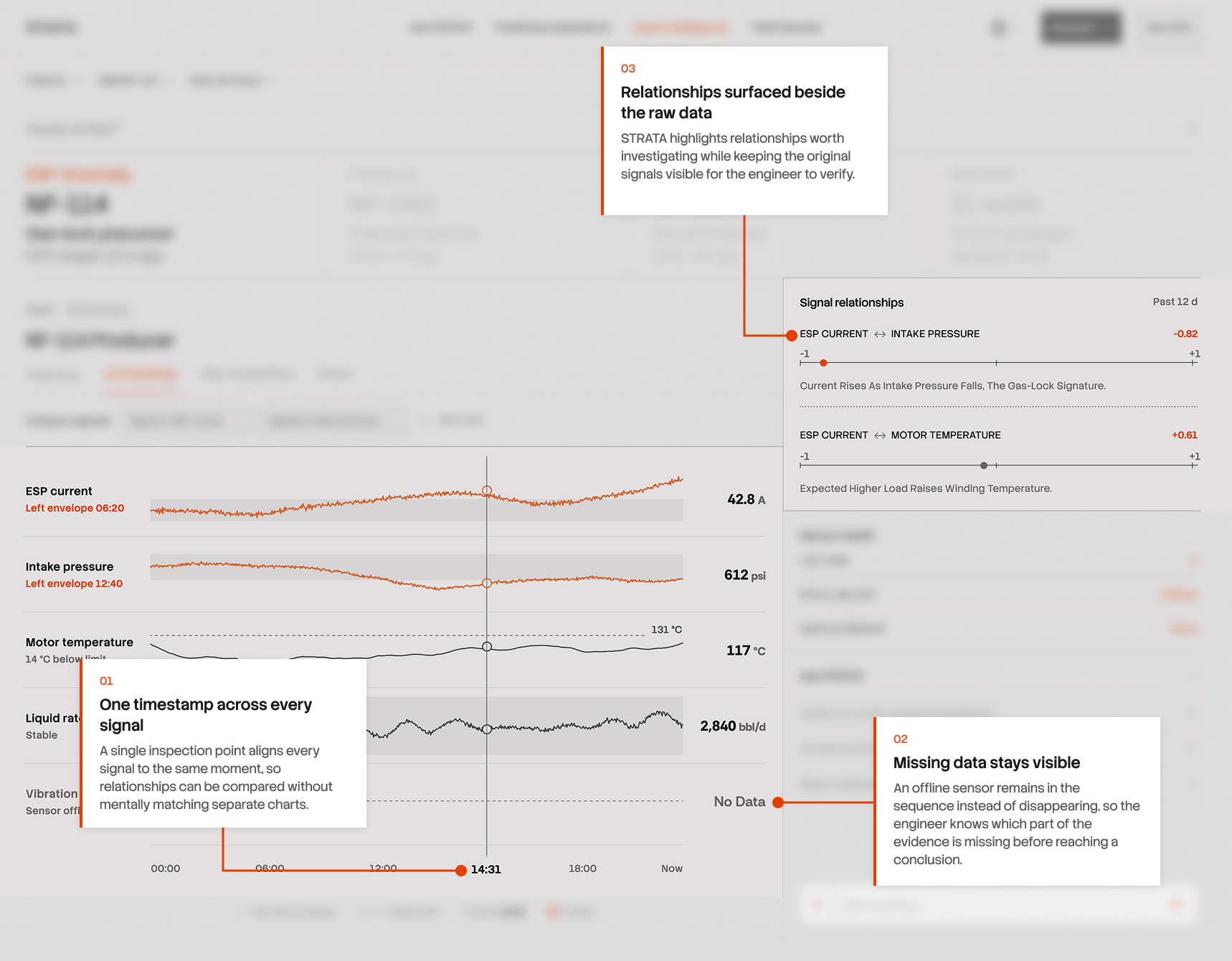
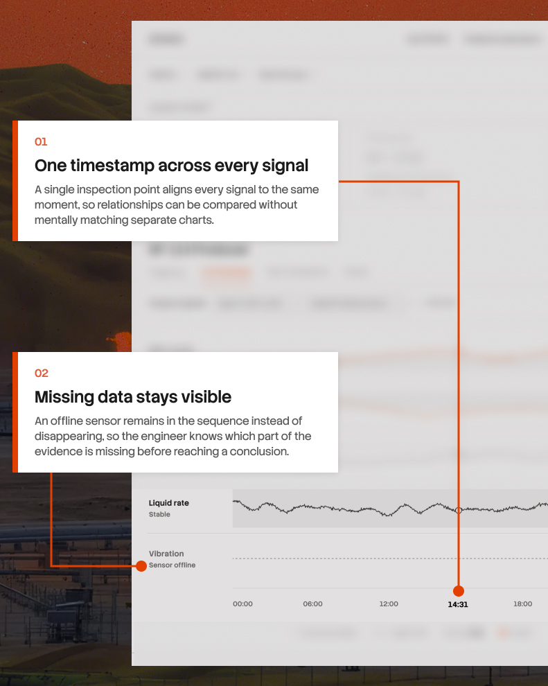
My first attempt put all four readings on one chart, the way most monitoring tools do. It didn't work. They're measured in completely different units, so putting them on the same scale either flattens the small changes or exaggerates the big ones, and the thing I needed people to see disappeared. So I gave each reading its own lane and its own scale, and ran a single line down through all of them. Now the moment they start moving apart is a place on the screen you can point at.

Each lane also has a shaded band behind it showing where this well normally sits, we call this the envelope. That way nobody has to remember whether a number is high for this particular equipment. They just see a line leaving a shape. Two of them have.

The last decision was closer. One sensor on this well has been broken for six days. The tidy option is to remove it from the list. I left it there as an empty row, because someone working out what went wrong should know which of their instruments isn't reporting before they reach a conclusion.

After
Before

COMPARING WELLS IS EXPERT WORK, AND MOST TOOLS LEAVE YOU TO DO IT ALONE

07/ ASSET INTELLIGENCE

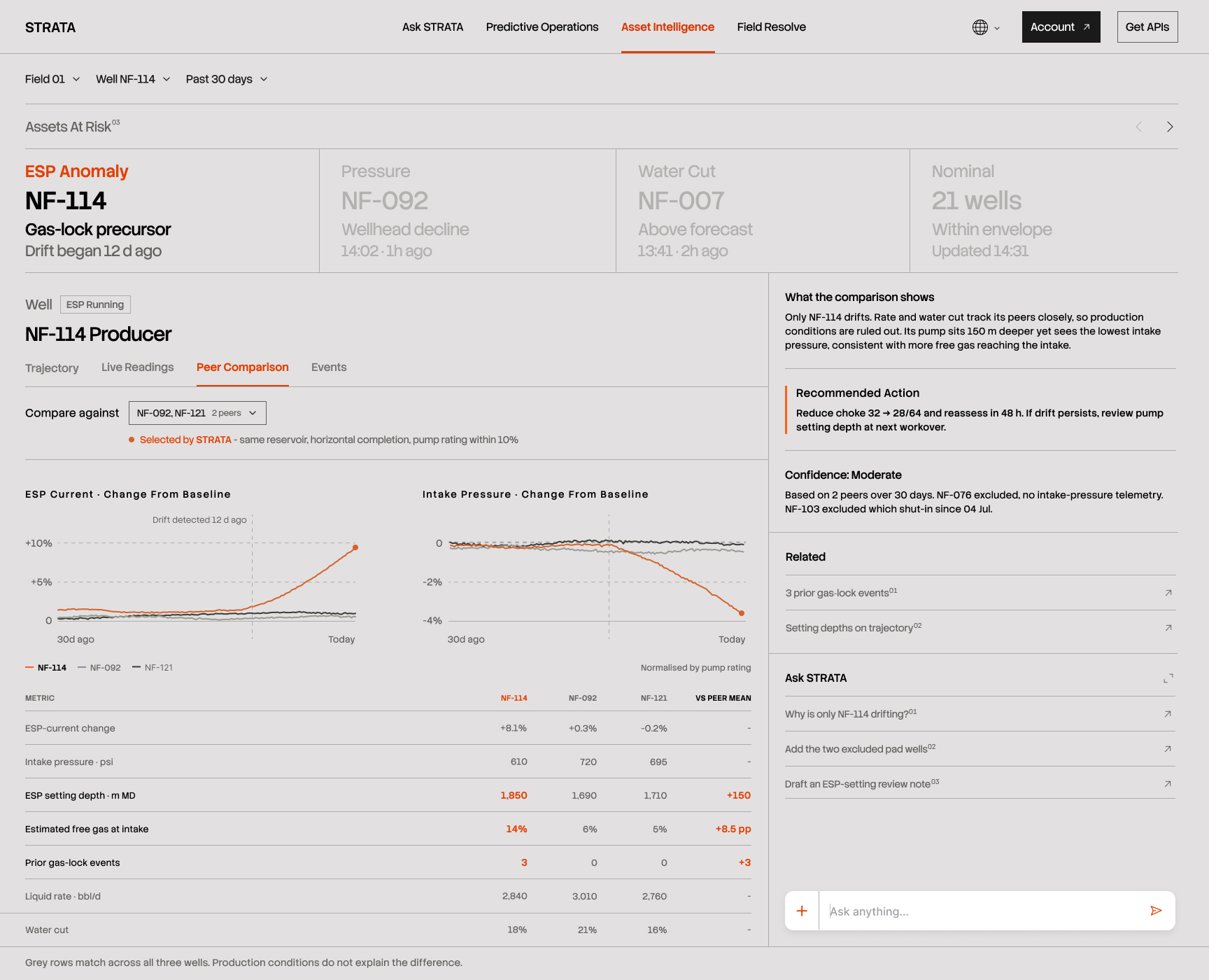
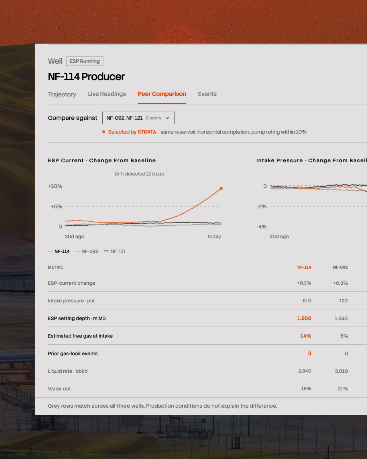
Knowing one well is behaving strangely isn't the same as knowing something is wrong with it. Wells sitting near each other share the same rock and the same conditions underground. If all of them were drifting, the problem would be the field, not the equipment, and the fix would be completely different.

So the next question is easy to ask and hard to answer: is this well behaving differently from its neighbours?

Hard, because choosing which neighbours to compare against is a judgement call. Wells differ in depth, in age, in the kind of pump they use, in which part of the reservoir they draw from. Compare against the wrong ones and the answer is worthless. Most software hands you a dropdown and leaves you to it.

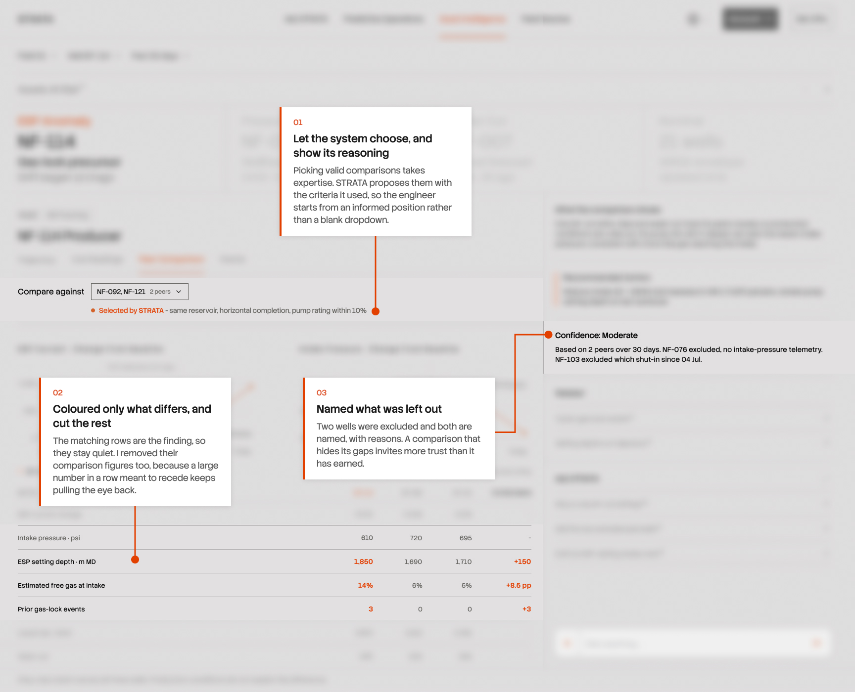
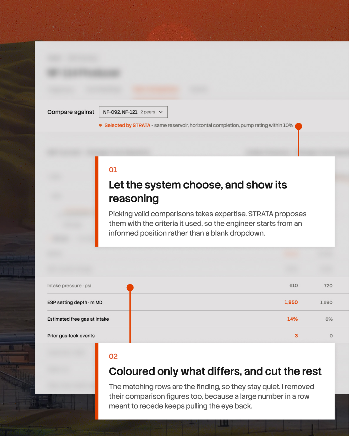
I had the system choose, and show its reasoning. It proposes two wells and states why it picked them, so the engineer is judging a choice rather than making one from a blank list. That felt like the right kind of task to hand over because doing it well means holding a lot in your head, and getting it slightly wrong quietly invalidates everything that follows.

The table underneath was the harder problem. My first version highlighted every number for the well under investigation, which made all of it look meaningful. But most of those numbers matching is the entire finding. It's what rules out the rock, the field, and the weather. So I greyed out every row where the three wells agree and left colour only on the rows where they don't. I went further and removed the comparison figures from the grey rows altogether, because a large number sitting in a row I was trying to quiet kept pulling attention back to it.

What's left is three differences. This well's pump sits 150 metres deeper than its neighbours', it has noticeably more gas at the pump intake, and it has failed this way three times before while neither of the others has failed at all.

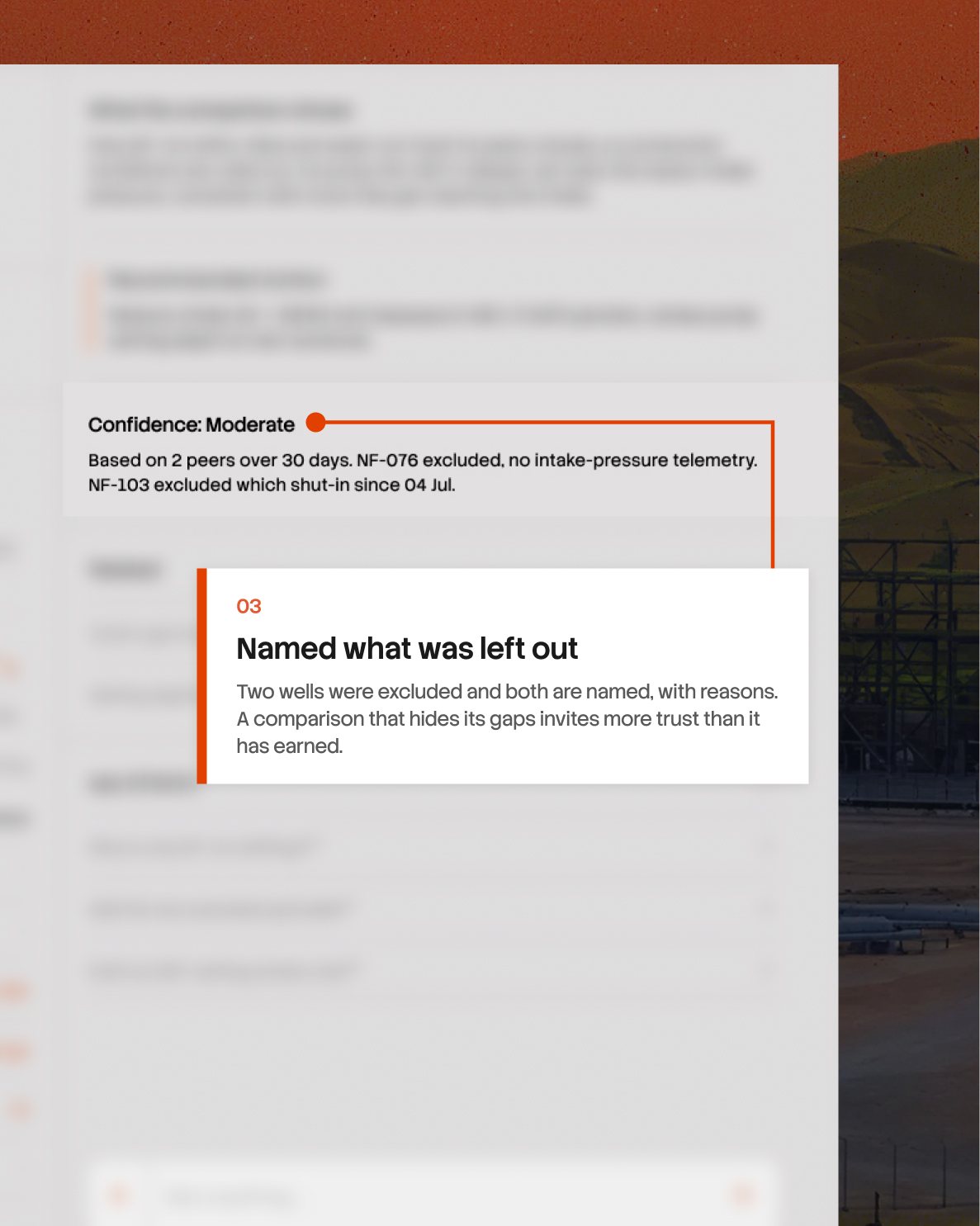
Below that, the system states how confident it is and why. Two other wells were considered and left out, both named, one because a sensor that matters here has no usable data and the other because it's been shut down since July. It would have been easy to compare against whatever was available and never mention what was missing, and the comparison would have looked stronger for it.

After
Before
After
Before

A WELL CAN'T TELL YOU WHAT'S WRONG, ONLY THAT SOMETHING IS

06/ ASSET INTELLIGENCE

A well is a hole in the ground with a pump at the bottom. You can't inspect it. Nobody goes down to look. Everything anyone knows about it comes from a handful of sensors reporting numbers to the surface, and those numbers only say how much, how much current, how much pressure, how much liquid. Never why.

That changed what I was designing. This screen for noticing when two numbers stop agreeing.

My first attempt put all four readings on one chart, the way most monitoring tools do. It didn't work. They're measured in completely different units, so putting them on the same scale either flattens the small changes or exaggerates the big ones, and the thing I needed people to see disappeared. So I gave each reading its own lane and its own scale, and ran a single line down through all of them. Now the moment they start moving apart is a place on the screen you can point at.

Each lane also has a shaded band behind it showing where this well normally sits, we call this the envelope. That way nobody has to remember whether a number is high for this particular equipment. They just see a line leaving a shape. Two of them have.

The last decision was closer. One sensor on this well has been broken for six days. The tidy option is to remove it from the list. I left it there as an empty row, because someone working out what went wrong should know which of their instruments isn't reporting before they reach a conclusion.

After
Before
After
Before

COMPARING WELLS IS EXPERT WORK, AND MOST TOOLS LEAVE YOU TO DO IT ALONE

07/ ASSET INTELLIGENCE

Knowing one well is behaving strangely isn't the same as knowing something is wrong with it. Wells sitting near each other share the same rock and the same conditions underground. If all of them were drifting, the problem would be the field, not the equipment, and the fix would be completely different.

So the next question is easy to ask and hard to answer: is this well behaving differently from its neighbours?

Hard, because choosing which neighbours to compare against is a judgement call. Wells differ in depth, in age, in the kind of pump they use, in which part of the reservoir they draw from. Compare against the wrong ones and the answer is worthless. Most software hands you a dropdown and leaves you to it.

I had the system choose, and show its reasoning. It proposes two wells and states why it picked them, so the engineer is judging a choice rather than making one from a blank list. That felt like the right kind of task to hand over because doing it well means holding a lot in your head, and getting it slightly wrong quietly invalidates everything that follows.

The table underneath was the harder problem. My first version highlighted every number for the well under investigation, which made all of it look meaningful. But most of those numbers matching is the entire finding. It's what rules out the rock, the field, and the weather. So I greyed out every row where the three wells agree and left colour only on the rows where they don't. I went further and removed the comparison figures from the grey rows altogether, because a large number sitting in a row I was trying to quiet kept pulling attention back to it.

What's left is three differences. This well's pump sits 150 metres deeper than its neighbours', it has noticeably more gas at the pump intake, and it has failed this way three times before while neither of the others has failed at all.

Below that, the system states how confident it is and why. Two other wells were considered and left out, both named, one because a sensor that matters here has no usable data and the other because it's been shut down since July. It would have been easy to compare against whatever was available and never mention what was missing, and the comparison would have looked stronger for it.

SOMETIMES THE INVESTIGATION HAS TO GO BACK TO HOW THE WELL WAS BUILT

The trajectory tells an engineer where the pump sits today. But when an issue keeps returning, the current state is only part of the story. Engineers may also need to understand how that section of the well was originally constructed, which assembly was used, how the run progressed through depth, and whether anything unusual was recorded along the way.

That information usually exists in construction records and drilling reports. Useful, but disconnected from the well the engineer is already investigating.

I wanted that history to feel like another layer of the asset.

From the highlighted interval, STRATA opens a construction replay that moves through the historical run by depth and time. Components and recorded events appear where they occurred, while the trajectory stays visible alongside it, keeping the past tied to the physical location that made it relevant.

Importantly, STRATA treats this as context. A historical event near the same interval may be worth investigating, but the interface never presents it as the cause of what is happening today.

After
Before

A FAILURE MATTERS MORE WHEN YOU CAN SEE WHAT HAPPENED BEFORE IT

08/ ASSET INTELLIGENCE

Everything so far has been about the present. What the well is doing now, how it compares to its neighbours now. The last question is whether any of this has happened before.

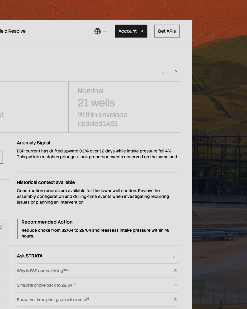
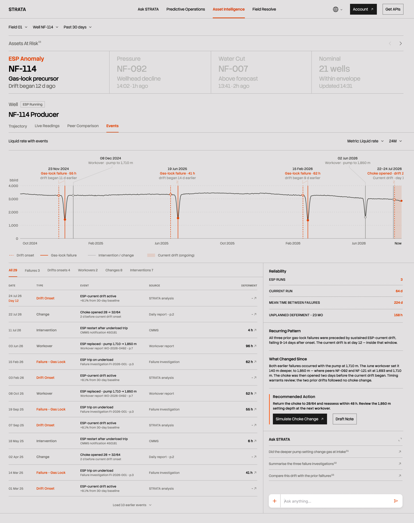
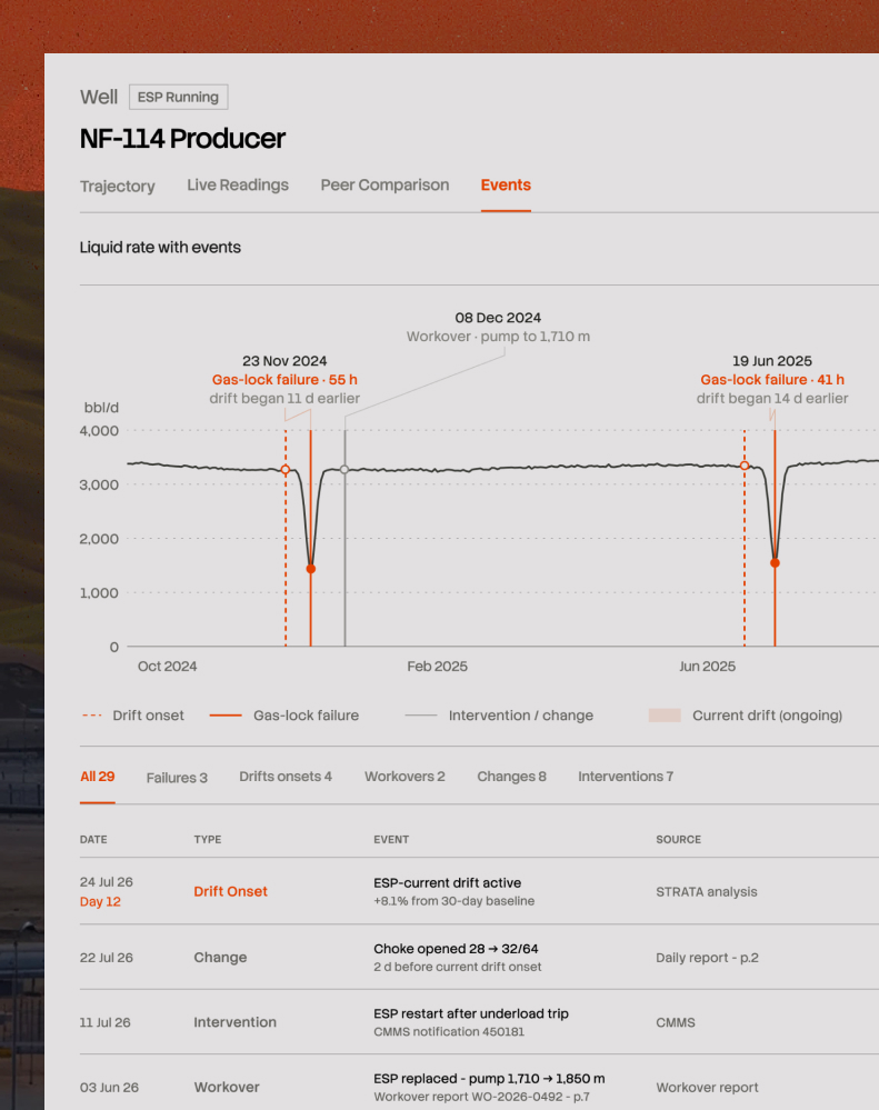
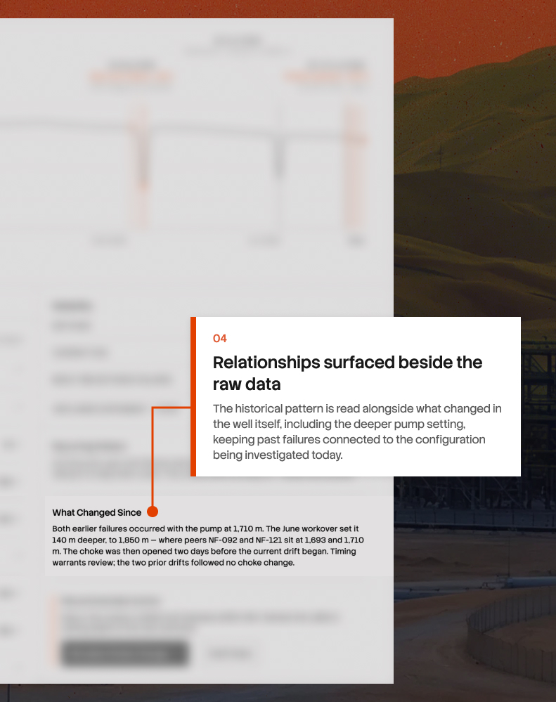
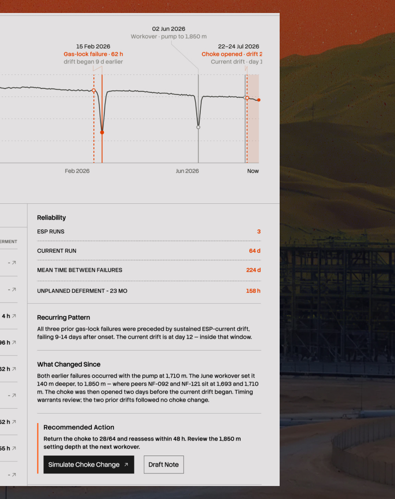
It has. Three times in two years, this well has failed the same way. And each time, the same slow rise in current came first - 11 days before, then 14, then 9. Today is day 12.

That's the finding, and it wasn't hidden. It was sitting in a maintenance report, two failure investigations, and a set of daily production logs, filed in different systems by different teams over two years. Nobody had put them side by side because nobody had reason to until now.

So the design problem was making a chronology out of records that weren't meant to be read as one.

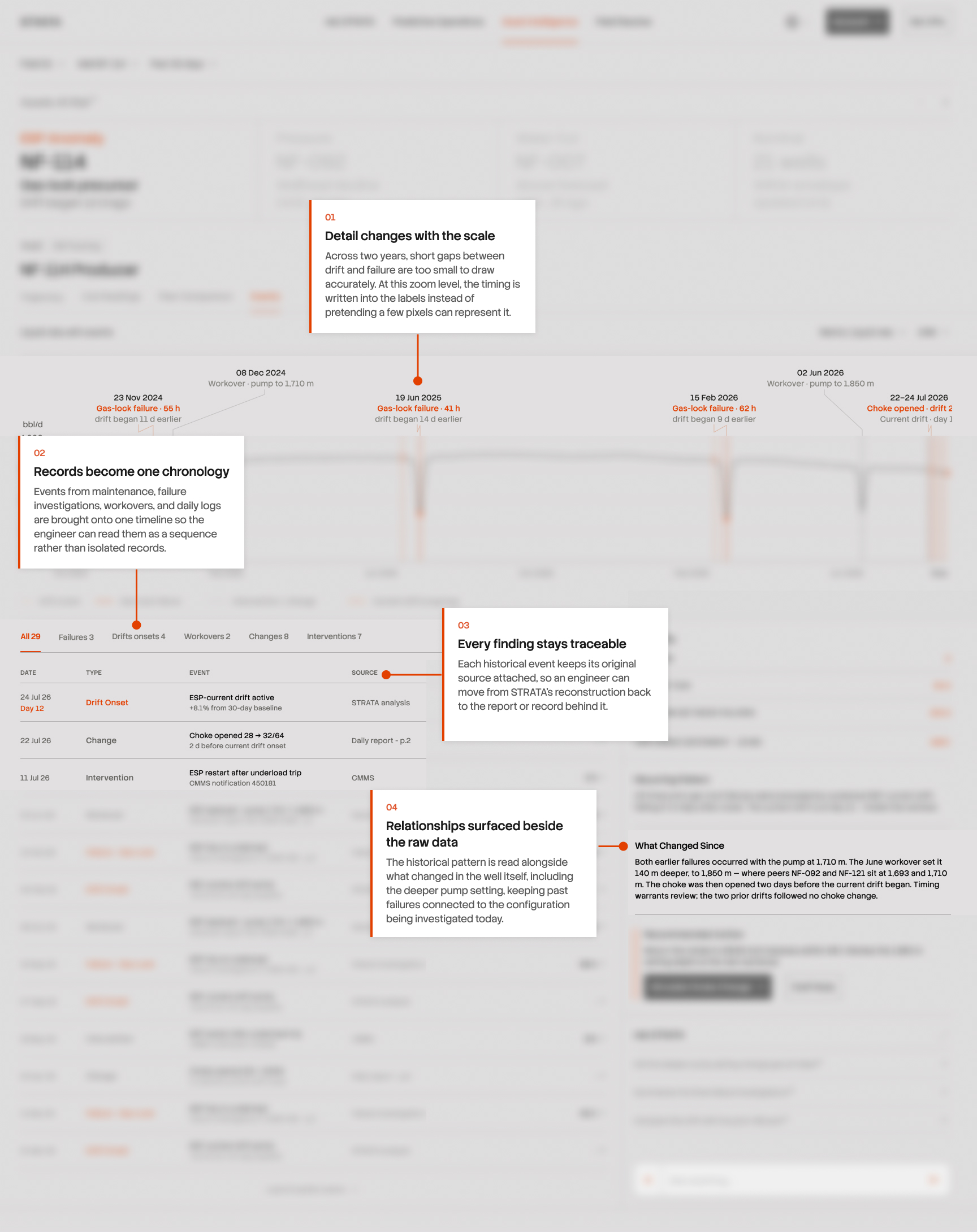
Every row cites where it came from, a workover report with a page number, a maintenance notification, a daily log. That was deliberate and slightly against my instincts, because the citations make the table denser and a cleaner version would have looked better. But a well history assembled by a model is only worth anything if an engineer can open the underlying document and check it. Without the citation it's just a claim.

The chart above the table posed another problem. Two years of production with ten events marked on it meant labels overlapping into unreadable clumps. My first fix was to shrink them, which made it worse. What actually worked was accepting that some detail can't be shown at this scale: the 11-day gap between a drift starting and the failure that followed is real, but it's two pixels wide across two years, so drawing it is a lie. At this range it becomes text on the label. Zoom in and it becomes a shape again.

The panel on the right closes the loop back to the last tab. Both earlier failures happened with the pump at its old depth. It was moved deeper in June. This is the first drift since.

After
Before
After
Before
After
Before
After
Before
After
Before
After
Before
After
Before

A FAILURE MATTERS MORE WHEN YOU CAN SEE WHAT HAPPENED BEFORE IT

08/ ASSET INTELLIGENCE

Everything so far has been about the present. What the well is doing now, how it compares to its neighbours now. The last question is whether any of this has happened before.

It has. Three times in two years, this well has failed the same way. And each time, the same slow rise in current came first - 11 days before, then 14, then 9. Today is day 12.

That's the finding, and it wasn't hidden. It was sitting in a maintenance report, two failure investigations, and a set of daily production logs, filed in different systems by different teams over two years. Nobody had put them side by side because nobody had reason to until now.

So the design problem was making a chronology out of records that weren't meant to be read as one.

Every row cites where it came from, a workover report with a page number, a maintenance notification, a daily log. That was deliberate and slightly against my instincts, because the citations make the table denser and a cleaner version would have looked better. But a well history assembled by a model is only worth anything if an engineer can open the underlying document and check it. Without the citation it's just a claim.

The chart above the table posed another problem. Two years of production with ten events marked on it meant labels overlapping into unreadable clumps. My first fix was to shrink them, which made it worse. What actually worked was accepting that some detail can't be shown at this scale: the 11-day gap between a drift starting and the failure that followed is real, but it's two pixels wide across two years, so drawing it is a lie. At this range it becomes text on the label. Zoom in and it becomes a shape again.

The panel on the right closes the loop back to the last tab. Both earlier failures happened with the pump at its old depth. It was moved deeper in June. This is the first drift since.

EVENTUALLY, SOMEONE HAS TO GO OUT AND FIX IT

EVENTUALLY, SOMEONE HAS TO GO OUT AND FIX IT

09/ FIELD RESOLVE

Everything so far happened at a desk. But wells and plants are physical, and at some point a person walks out to the equipment with a wrench. That handover is where most of the work gets lost. The engineer who spent an hour building a picture of the problem writes a short summary into a maintenance system, a technician picks it up with none of that context, and often files a second report describing what they found. Two people, two records, one problem, nothing connecting them.

Field problems also don't arrive one at a time. On any given day there's a backlog: a leak here, a missing handrail there, corrosion on a line somewhere else, arriving from different people at different times with wildly different urgency.

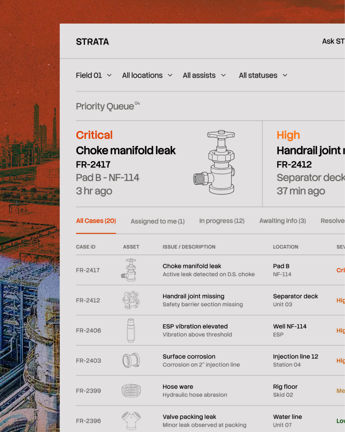
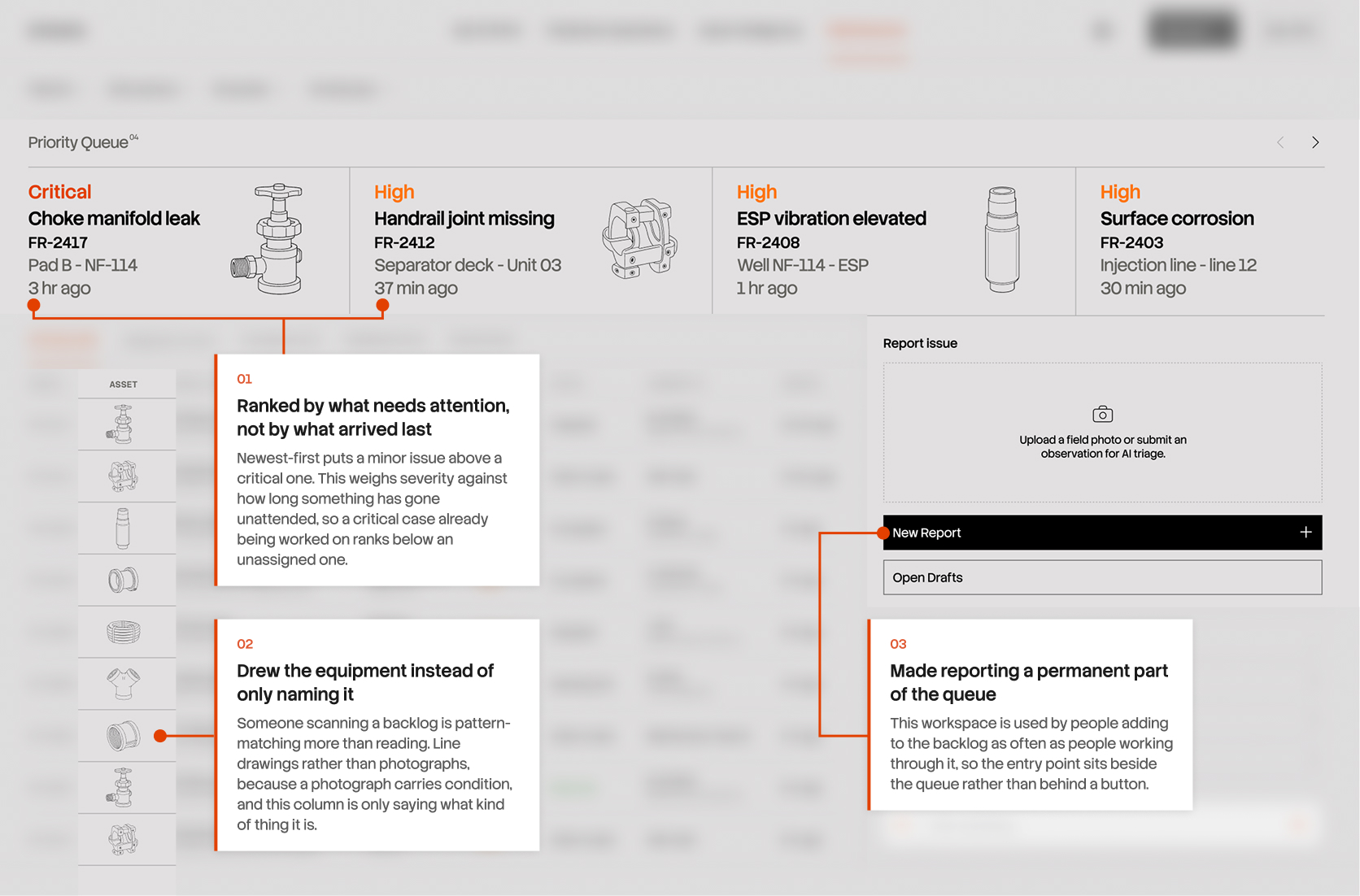
So the screen opens with four cases pulled to the top. A critical leak twelve minutes old, then three high-severity issues. Below that, everything else in a table with severity, status, and who owns it.

The decision here was ordering. Sorting by newest is the obvious default and it's wrong, because it puts a low-severity report from ten minutes ago above a critical one from an hour ago. Sorting purely by severity is also wrong, because a critical case already assigned and being worked on needs less attention than an unassigned one. The queue weighs severity against how long something has gone unattended, and the four at the top are what the system thinks should be dealt with first.

The asset column uses line drawings rather than text alone. Someone scanning a backlog is pattern-matching more than reading, and a valve, a hose, and a flange are distinguishable at a glance in a way that "choke manifold leak" and "valve packing leak" are not. I used technical illustrations rather than photographs deliberately. A photograph of equipment carries information about its condition, and in this column the only claim being made is what kind of thing it is.

The right-hand column is the reporting entry point rather than a filter panel. This workspace is used by people about to add to the queue as often as by people working through it. And it's the one part of the platform designed for a phone first, because it's the only part used standing up.

After
Before

FROM A PHOTOGRAPH TO A CLOSED CASE

FROM A PHOTOGRAPH TO A CLOSED CASE

10/ FIELD RESOLVE

A field worker standing at a leaking flange has a phone and a problem in front of them. What they don't have is patience for eleven form fields, which is why field reports are so often two words long and useless to whoever picks them up.

So the report starts with the photograph. STRATA reads the image, identifies the equipment, and fills the form in: asset, location, issue type, severity, and a description of what it can see. The person confirms or corrects rather than typing from nothing.

Analysis takes a few seconds, which is long enough to feel broken if nothing happens. A spinner would have covered it. Instead the screen names each step as it completes: identifying equipment, inspecting visible condition, checking similar field records. That fills the wait, but it also tells the truth about what's happening, and the third step is worth knowing about because searching previous cases is different work from reading a photograph.

The decision I spent longest on was how much to prefill. Fill everything and people click through without reading, which is worse than an empty form because now there's a plausible-looking record nobody checked. So each proposed value carries its confidence, 94% on the asset and 87% on the likely issue, and the section is labelled prefilled by STRATA. The system is making a proposal and the interface says so.

That's the report. What happens to it afterwards was the harder design problem.

Months later, someone will ask what happened here. Maybe an auditor, maybe an incident investigation, maybe an engineer whose well is doing the same thing. So the case record is built to answer that rather than to look finished.

The original photograph sits beside the one taken after the repair, labelled before and after, each with its own timestamp and the name of who took it. Two people, two moments, and the visual evidence that the problem existed and then didn't.

STRATA's original assessment stays on the record with its confidences intact, next to what was actually found and done. If the system identified the wrong equipment or underestimated the severity, that's preserved rather than quietly overwritten by the outcome. A system that edits its own history to look correct isn't a record of anything.

The state changes are the part I'd defend hardest. Reported, assigned, in progress, awaiting verification, resolved, each with a person and a time. Verification is a separate step performed by someone other than whoever did the work, because a technician marking their own repair complete isn't a check on anything. That distinction is the difference between a workflow and an audit trail.

This is the least glamorous screen in the product, and the one that decides whether any of the rest of it can be trusted six months from now.

WHAT STRATA BECAME

WHAT STRATA BECAME

Every part of this problem already has software. Sensor systems, laboratory systems, maintenance systems, document archives. None of them is broken, and I didn't set out to replace any of them. What none of them does is hold on to context when the problem moves somewhere else. A refinery tool stops at the refinery fence. A maintenance system knows about work orders and nothing about why the work was ordered. So the joining falls to a person, every time, from scratch, and most of the time it doesn't happen at all.

STRATA is one continuous thread through that. A prediction explains itself, and the explanation points upstream. The well it points to carries its own history, its own comparisons, and its own record of what changed and when. When something needs fixing, the case that gets raised carries all of it, and closes with evidence anyone can check months later.

Three things held throughout. Show the reasoning, not just the answer, because an unexplained number is an unused one. Say what you don't know, because a system that only reports its successes teaches people to discount everything it says. And let the work cross the boundaries the problem crosses, because the org chart is a human invention and the barrel moves through all of it.

This is a concept, and it hasn't been tested with the people it's for. The things I'd most want to put in front of a real production engineer are the ones I'm least sure about: whether the peer selection criteria match how they judge comparability, whether confidence percentages help or just add noise, and whether surfacing the model's own errors builds trust or erodes it faster than I think.

All data shown is fictional. The problems it describes are real.

More Projects

Subscribe to my newsletter and stay in touch.

© 2026 Khaled Aldosari. Original design work and writing—all rights reserved. Third-party trademarks and media belong to their respective owners.

Subscribe to my newsletter and stay in touch.

© 2026 Khaled Aldosari. Original design work and writing—all rights reserved. Third-party trademarks and media belong to their respective owners.

Subscribe to my newsletter and stay in touch.

© 2026 Khaled Aldosari. Original design work and writing—all rights reserved. Third-party trademarks and media belong to their respective owners.